Galaxis
Introducing a new all-in-one cloud-based software for
small and medium companies.

Responsibilities
- Heuristic review
- Benchmarking
- User research
- Persona creation
- User interviews
- Use cases
- Wireframing (LF & HF)
The story
In September 2014 I joined Intrasistemas as Web design team lead, we then started a new cloud-based project, where I was responsible for the web application design and frontend, as well as gathering vital data and getting user feedback.
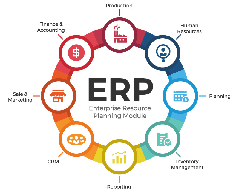
The first customer interested in this concept was a medium company focused on clothes production. The challenge was to deliver continuously modules or “small bits” of the whole software as well as the overall strategy that would integrate all of them.
The modules became part of the core concept of the software so we began to call it Galaxis, multiple functional processes that worked together in harmony.
My role in the project
Participated in multiple web marketing strategies, collaborating with other developers, designers and product owners. In charge of the UX direction and UI design of Galaxis. The goal was to increase the revenue by maximizing the efficiency of manufacturing processes of textile industries.
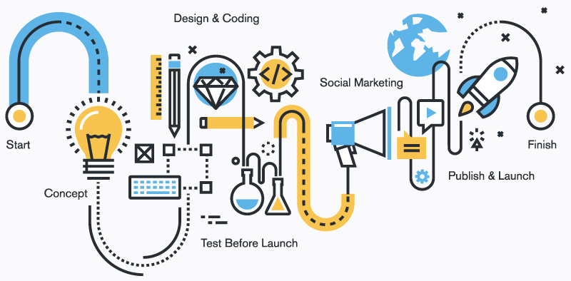
- Design solutions based on business goals, user needs, product scope and design thinking.
- Participated in various aspects of the design process (research, ideation, design and implementation).
- Wireframe design of user interfaces, interactions, and architecture.
- Worked with development, sales team and CEO on decision making related to UX/UI guidelines and best practices for the company’s clients.
- Responsible for transforming user feedback into wireframes or content strategies.
- Manage multiple website projects from concept to completion.
- Present and effectively communicate concepts to internal and external clients.
- Responsible of conducting user tests and interviews.
- Managing a small team with designers and developers to Galaxis’ deliverables to the client.
- Coaching personnel so they can deliver a feasible solution to a specific client’s need.
- Reviewed existing and proposed products.
- Give advice to the CEO about the company’s areas of improvement related to design and e-marketing.
Project’s highlights
Automation and reliability
Users in a work environment tend to be stressed to quickly achieve results, in that sense, we needed to factor company’s ideal internet infrastructure, cloud-server stability, fast asynchronous calls, etc. to cover most of that potential issue.
Users diversity
Since the test-drive of the software was on a factory, there were many processes where we could have more than one type of Persona, from a laborer or a salesman to a department supervisor. Each of them with a different set of skills, education, work area issues, age, gender or even job goals.
In that scenario, we opted to identify common areas between them, taking advantage of that while specialising parts of the UI according to their role. Either info summaries of some sort or CTA’s for a specific task, that kept things semantic for each user.


Users previous affinity to desktop-like software
Before Galaxis started it’s implementation on that company, most of the users never used specialized software nor ERP. They were used to spreadsheets, documents, local area file sharing, email managers, their most advanced program was a Windows-based invoice generator.
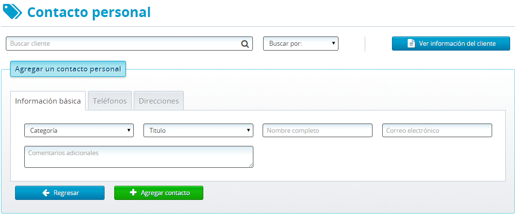
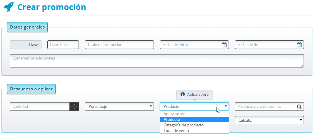
Having that in mind, we made Galaxis interfaces visual and functionally somehow similar, with title bars, explicit clickable or disabled buttons, tables that could work as a spreadsheet, grouping elements with boxes or tabs as well.
Users resistance to change
Even with an extensive presentation with the future benefits of the implementation (both financial and in productivity), many shown resistance to it. Not only high positioned personal but also many laborers, their common problem was the possibility of making tasks overly complex or the system demanding more input than the user really use.
Our strategy solved this by an initial setup of many common resources for all areas, so no more re-capture of info, also making as explicit as possible the titles and buttons, allowing to input only the basic data and leaving advanced details when needed as optional, using color schemes to communicate processes status helped clarifying the goal of each user flow.
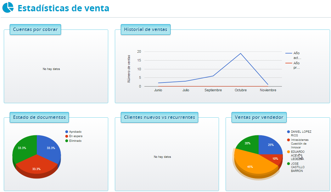
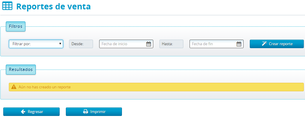
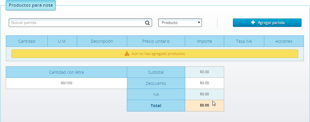
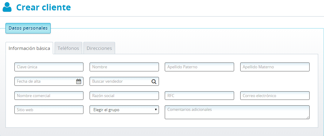
Sales module screenshots
More case studies
So far so good? If you want to know more about me, you can download my resume or my portfolio.

