HP Virtual Agent
Story
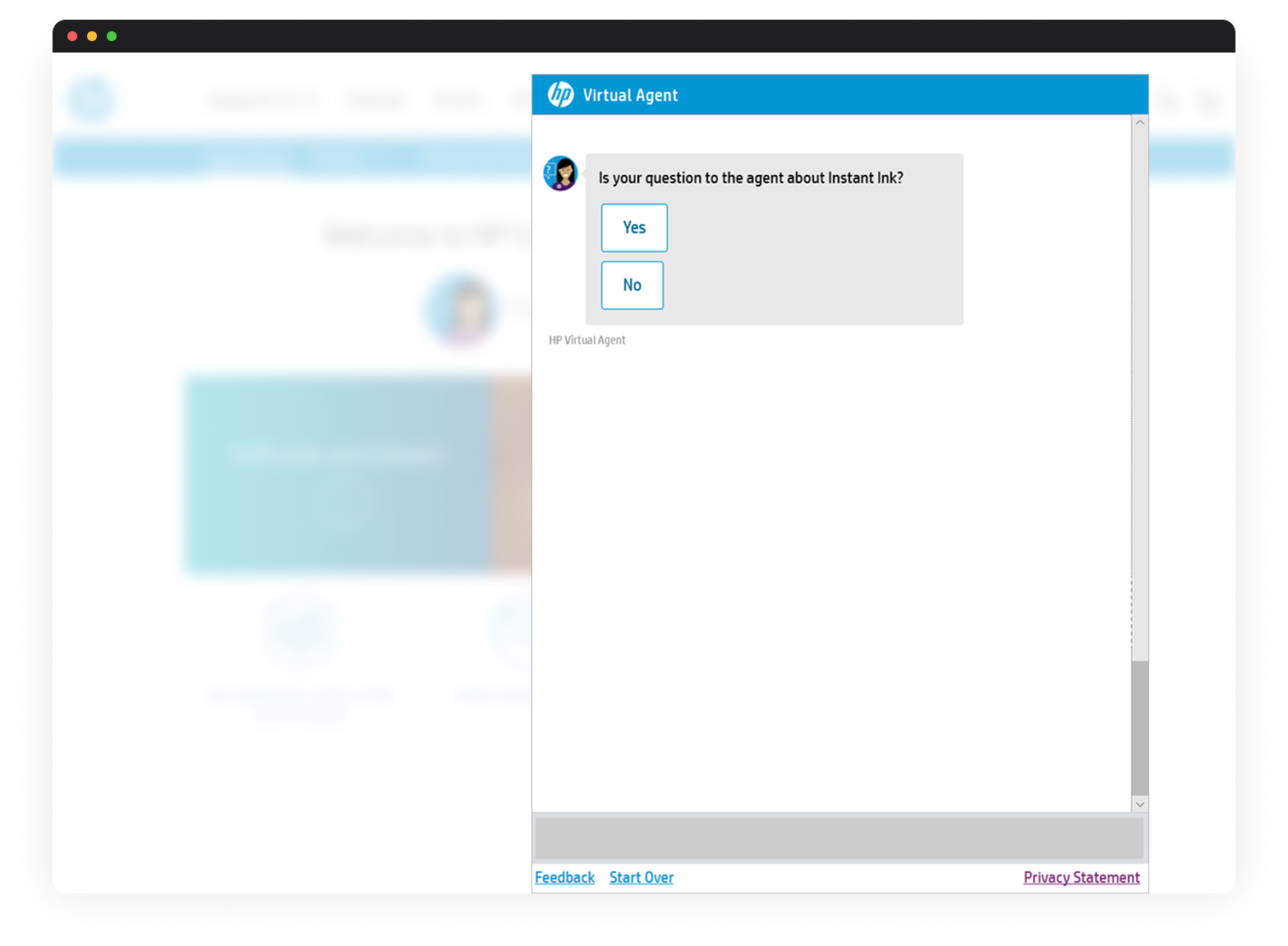
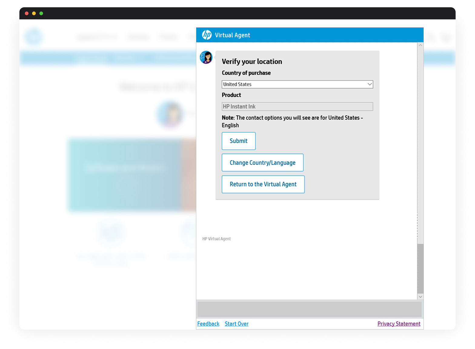
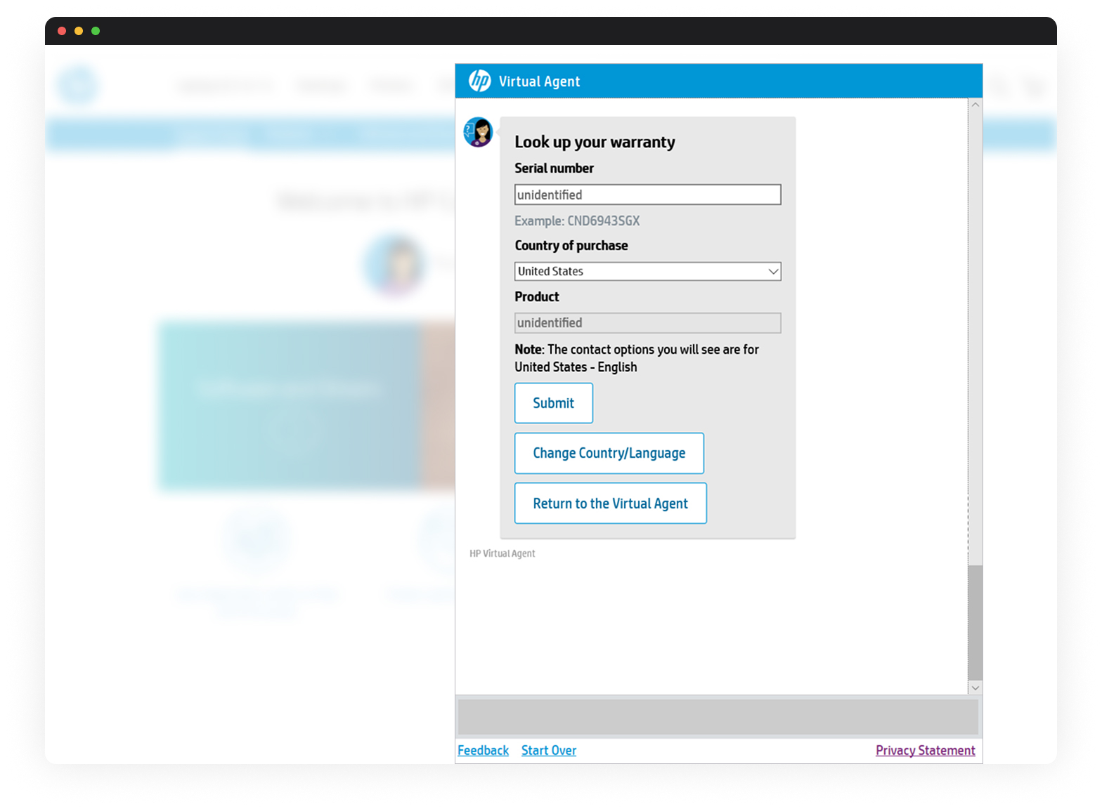
New tools, such as chatbots or virtual assistants, have emerged to simplify the interaction between customers and brands. HP’s AI-powered solution, Virtual Agent, empowers customers to solve IT issues with their HP devices. Some of its capabilities are step-by-step tutorials, product information, warranty checks, and other subscription services (Instant Ink and Smart Friend).
Due to the variety of HP’s customers, the main concern around this project was to make VA’s solutions efficient and simple to understand. Another challenge was to keep the answers natural (human-like) and semantic since multiple factors, like device type, warranty, region, language, or previous issues, needed to be considered.
My role
I was the leading UX designer responsible for analyzing AI agent flows and data, identifying trends or potential issues, socializing those findings to key stakeholders, providing detailed heuristic reviews of critical flows, and conducting design discovery of actionable UX items.
I collaborated with a multidisciplinary team, including product managers, engineers (Frontend, backend, and AI experts), and QA testers. Due to the company’s size, it was also important to share work updates with other departments, especially marketing.
Challenges
1. Complex infrastructure for an AI-powered agent.
Each customer query had to be evaluated through various contextual filters like product type, region, and issue history; these factors made testing and refining the experience difficult, especially when diagnosing root causes of user drop-offs. Updates to user flows required collaboration across AI, backend, and frontend teams, often leading to delays. This infrastructure demanded clear communication and tightly scoped interventions, highlighting the need for better documentation and coordination within the team.

2. Overly complex tutorials.
Many of the step-by-step tutorials offered by the Virtual Agent were hard to follow and filled with jargon or technical assumptions. For non-technical users, this created frustration and often led to early abandonment or escalation requests. Instructions lacked (to some extent) visual guidance or progressive disclosure, overwhelming users from the start. In some cases, the solutions didn’t match the current UI of HP software or the device’s appearance. There was also little differentiation between beginner and advanced support needs, which limited the value of self-service.

3. The Virtual Agent had poor marketing/advertising.
Despite the tool’s potential, many users were unaware that the Virtual Agent existed or what it could do since it was presented in a way that didn’t highlight its capabilities. Upon arrival at HP’s tech support page, users would sometimes bypass VA entirely in favor of calling support or reaching a person directly. Internally, marketing and product teams weren’t fully aligned on messaging, which made the agent’s brand presence weak and underutilized.
4. The team didn’t have a UX specialist for a long time.
Before I joined the team, UX was often overlooked in favor of engineering-driven decisions. Critical user flows had been built based on assumptions or internal needs, with minimal input from end users. As a result, there were inconsistencies across different support paths and a lack of standardization in language and layout. Design debt had accumulated, and documentation was scarce.
Solutions
1. Managed multiple teams’ expectations.
I established clear communication channels and regularly shared UX updates in stakeholder reviews. These sessions helped surface cross-team dependencies and allowed for early feedback. By presenting findings through heuristic evaluations, user data, and flow analysis, I gained support for changes that improved usability. I built trust and reduced unnecessary back-and-forth, and everyone stayed informed and focused on shared goals.
2. Documented heuristic reviews on flows with the least engagement.
I focused on uncovering usability issues and structural weaknesses, including missing feedback states, confusing copy, and unclear button hierarchies. Those categorized issues helped prioritize design updates, and these reviews made it easier for the engineering team to understand what needed fixing and why. Sharing this with stakeholders gave transparency to the design process. It ensured we were improving based on real evidence, not just assumptions.

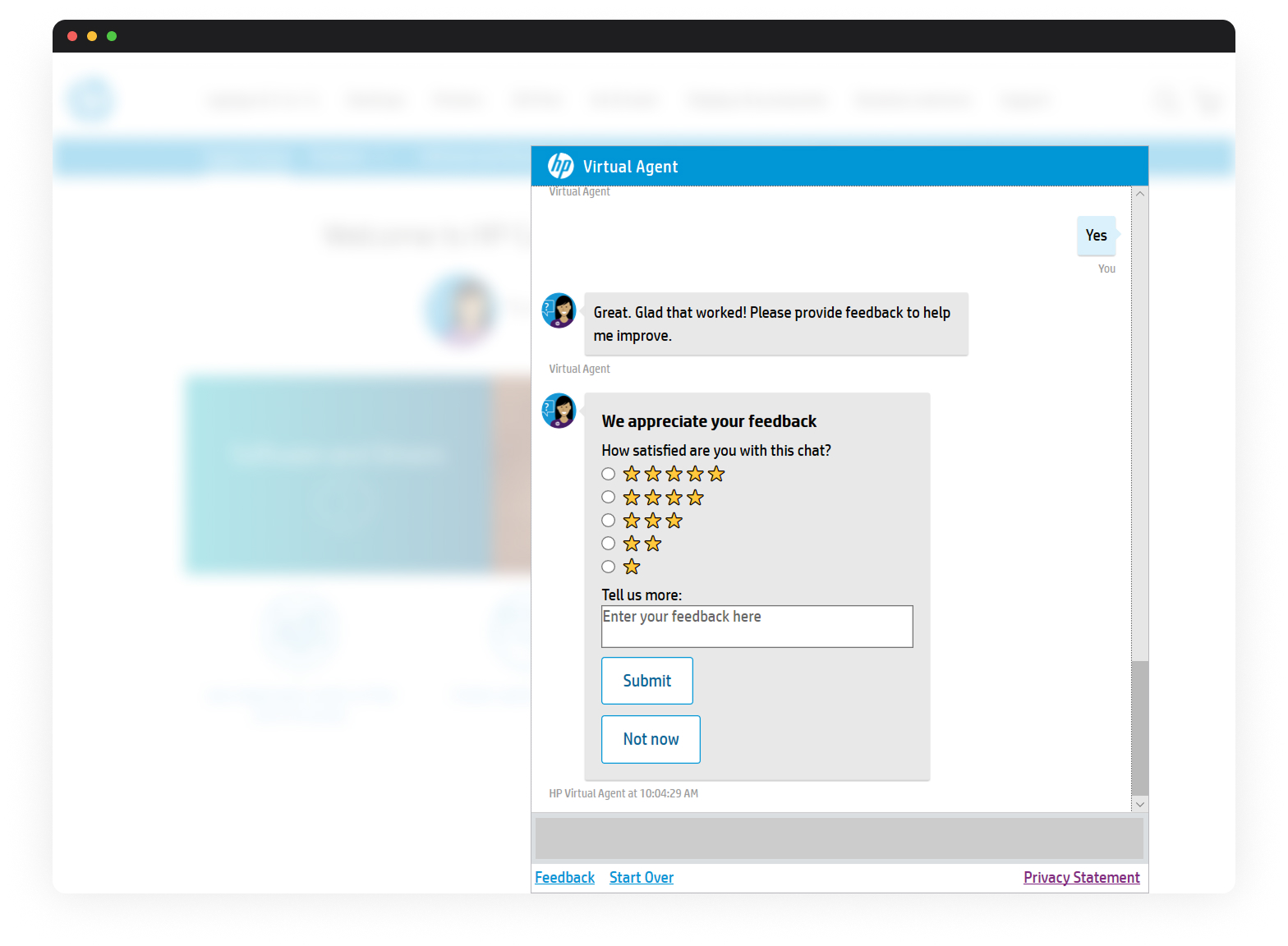
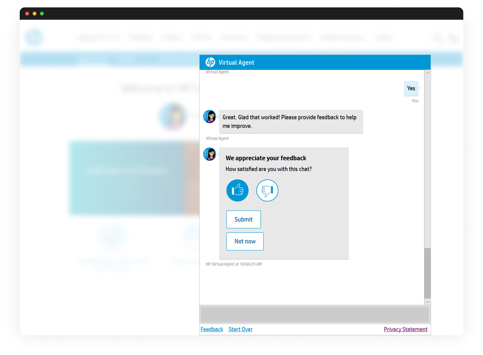
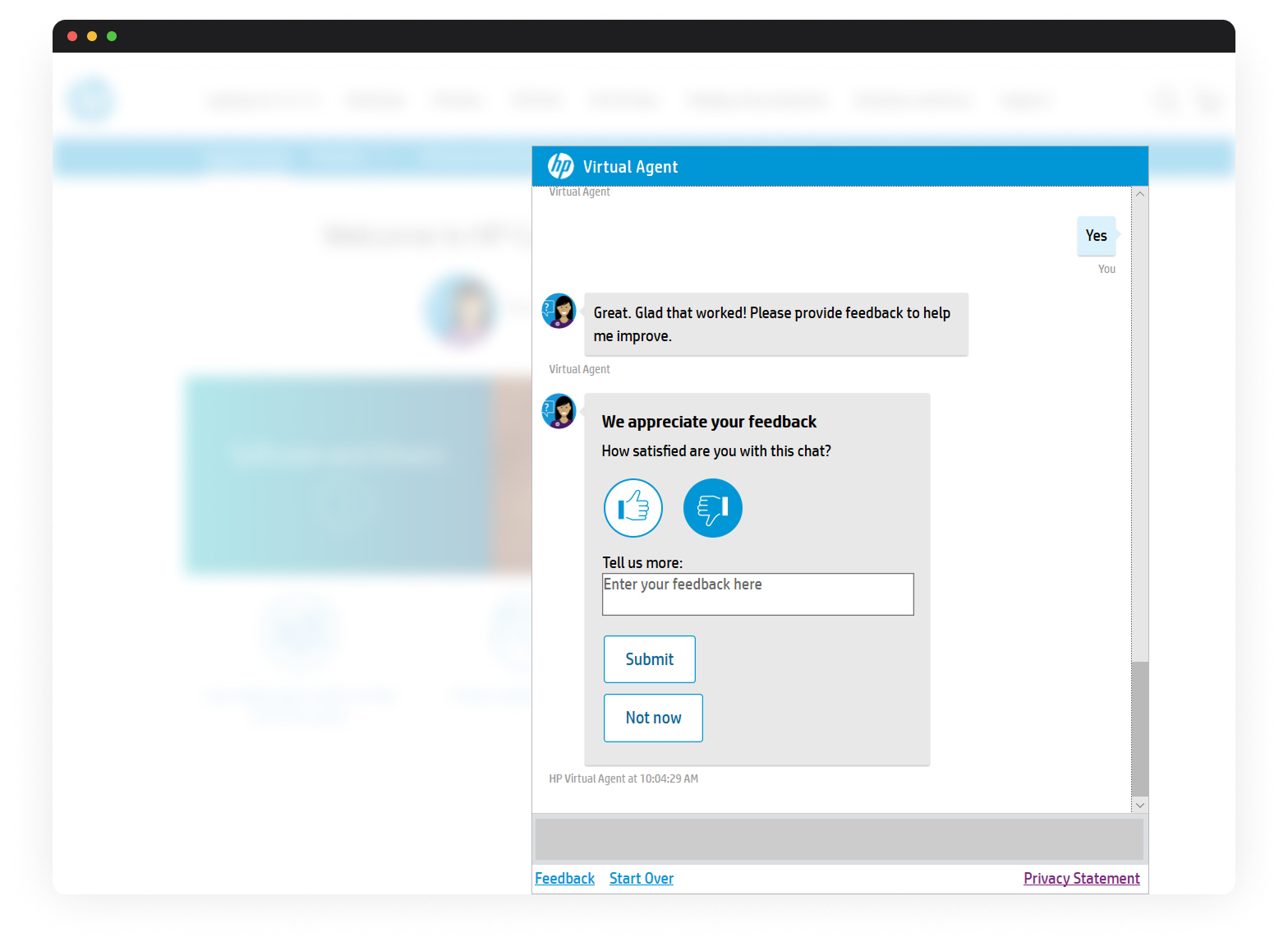
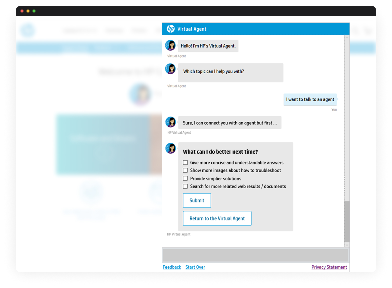
3. Designed flows to get the users’ feedback.
To better understand why users escalated, I created a simplified feedback form within the Virtual Agent that asked for some brief context before users were redirected to a live agent. The feedback data provided valuable insight into content clarity, user frustration, and missed expectations. I socialized some reports based on those responses, which helped us define some strategies to improve tutorial content and limit escalation triggers.
4. Executed A/B tests to validate design ideas.
I implemented A/B tests on updated UI elements and flow structures to mitigate risk and gather measurable insights. The tests revealed which changes improved engagement and had no significant effect, so I shared results with stakeholders to inform VA design decisions. A/B testing gave the team confidence to adopt improvements based on user behavior.
Outcomes
- An increased number of users engaged with the feedback form (∼9%).
- Detailed findings about why some users (∼7%) asked for immediate escalation.