Tricolor Plus

Story

Tricolor set out to disrupt the financial services industry, changing how credit-invisible consumers were considered when seeking financing. The company was founded to help Spanish-speaking immigrants in Texas get affordable car loans. With Tricolor’s fast expansion, the current digital strategy needed to be re-engineered to create the best customer experience and improve overall operational efficiencies.

Multiple internal systems didn’t deliver fully integrated solutions, resulting in disconnected customer experiences, sub-optimal business processes, and above-market technical cost structures.

My role

I was the leading UX designer responsible for conducting a competitor analysis of existing car dealership apps, conducting generative research and socializing findings with key stakeholders, providing artifacts like user personas and journey maps, and initiating the first phase of design discovery.

I collaborated with a multidisciplinary team, including product managers, full-stack engineers, and QA testers.

Challenges

1. Disjointed car dealership experiences.

Originally, customers could reach a payment portal after a couple of redirects from the corporate website, but the interface made it look like they were in the wrong place. The web payment portal and mobile app were designed so that the UI‘s look and feel became consistent with the brand guidelines and other marketing campaigns.

2. Outdated product strategy.

The customers had recurrent issues understanding the loan approval and the monthly payments process. So when they reached the customer support, the response time was excessive since the reps had to go through a lot of “small apps” to get a full perspective on the matter. Considering traffic from mobile devices represented the majority of visits to Tricolor’s website, the approach was to develop a fully-featured mobile app for customers, so they could manage the billing of their loan and also request a new one.

3. Poor communication among internal stakeholders.

There was a noticeable disconnect between different departments, product, engineering, and customer service teams. Each had different understandings of user pain points. Key decisions were made in silos without proper cross-functional input, making it hard to capture and act on them efficiently. Valuable insights were frequently lost or overlooked, and these gaps weakened team confidence and delayed meaningful progress.

Solutions

1. Aligning user and business needs.

To bridge the gap between user expectations and business goals, I facilitated some workshops that reframed challenges for the business model. We mapped user pain points and operational inefficiencies to help stakeholders see the potential impact of UX. This alignment helped guide the product roadmap more strategically while creating space for continuous input from users and teams.

2. Managed stakeholders’ expectations.

Given the number of teams involved, I worked to create consistent communication loops through presentations, documentation, and regular check-ins. This helped ensure everyone had visibility into research findings, design progress, and technical considerations. I established shared goals and timelines early to set realistic expectations and reduce surprises. When trade-offs had to be made, I provided context and rationale grounded in user feedback and business value.

3. Research-based design discovery.

I conducted moderated user interviews to uncover how users interacted with car dealership platforms and what pain points they faced. In parallel, I used competitive analysis to benchmark features and identify innovation gaps. Artifacts like user personas and journey maps brought empathy into the process, made decision-making more user-centered, and ensured continuous socializing findings to maintain stakeholder alignment. This research-first approach helped validate ideas early and reduce the risk of misaligned development.

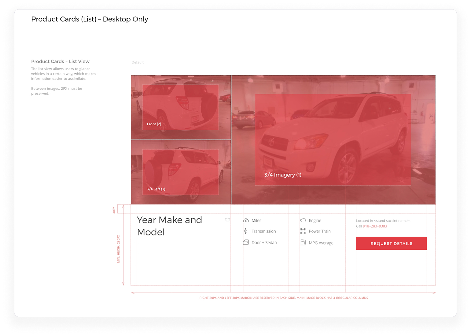
4. Implementation of the first iteration of the design system.

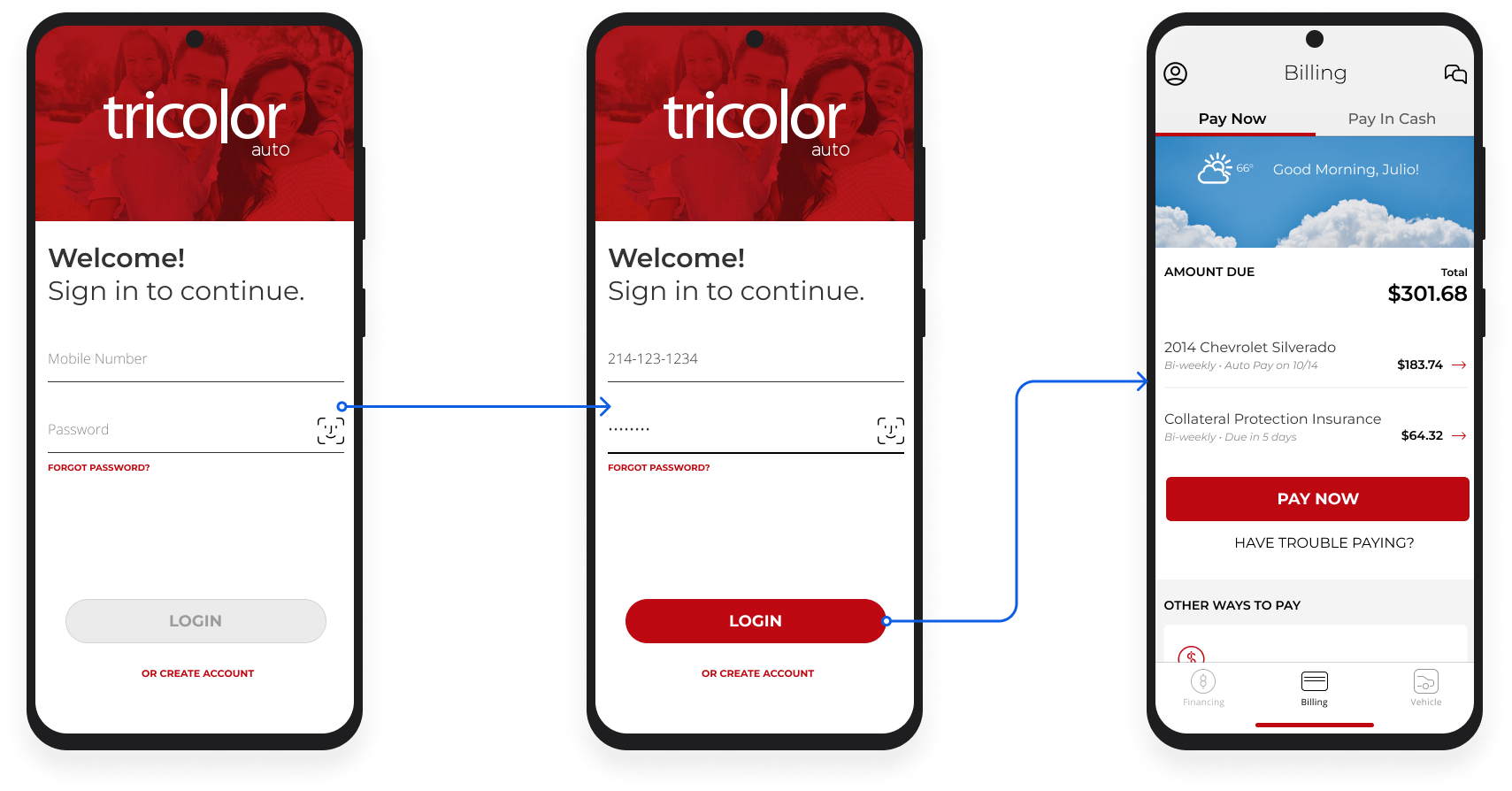
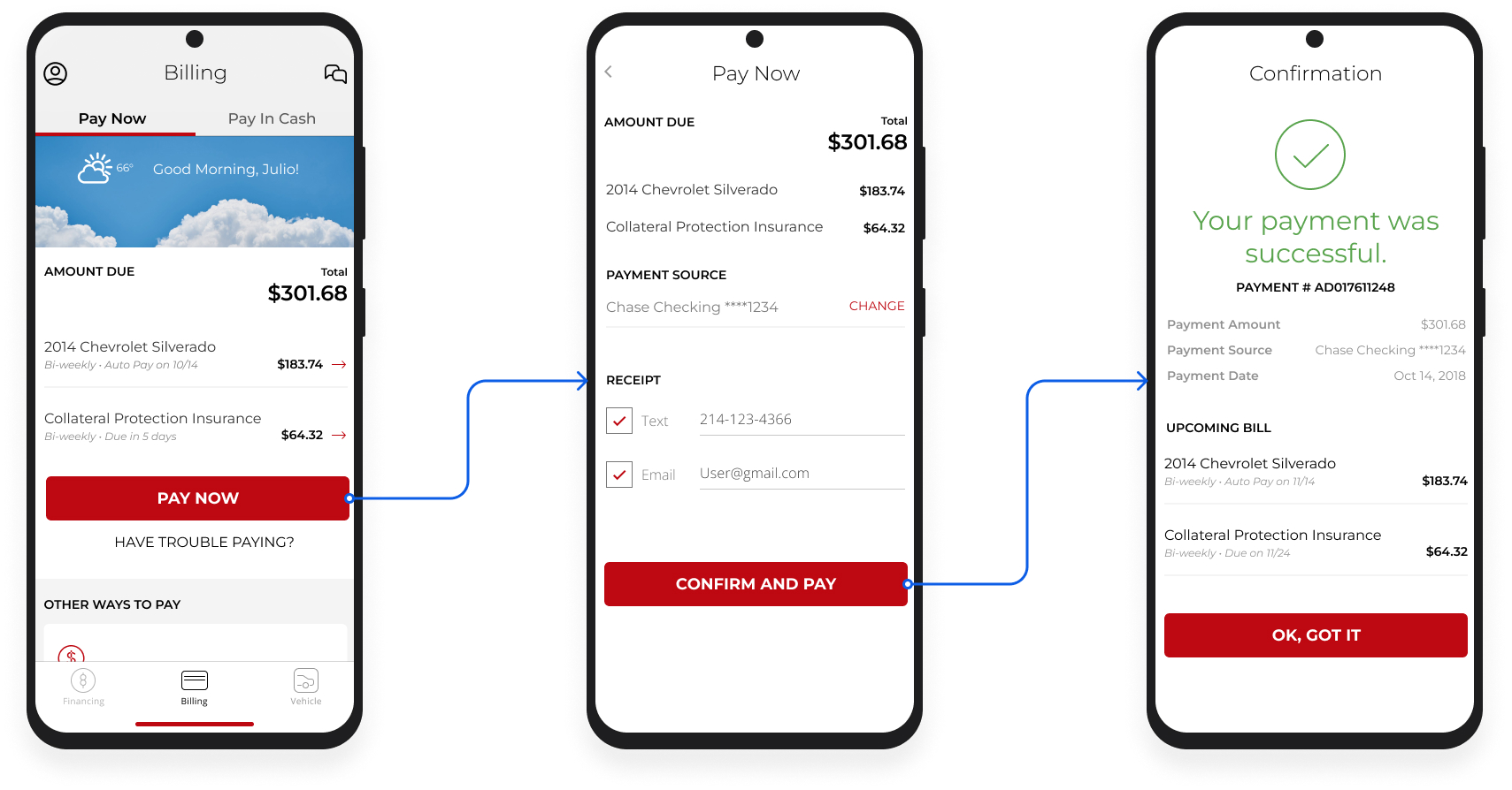
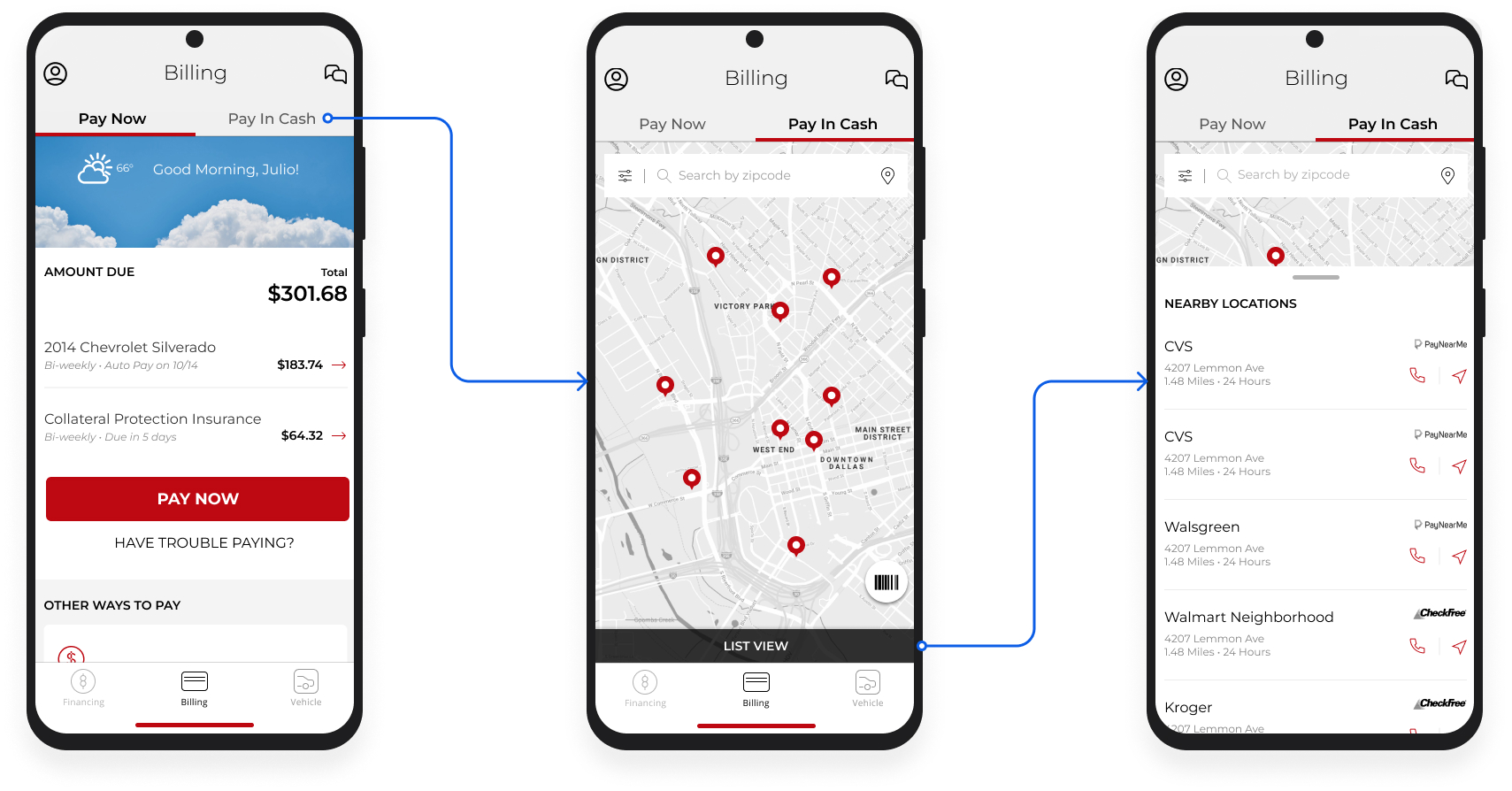
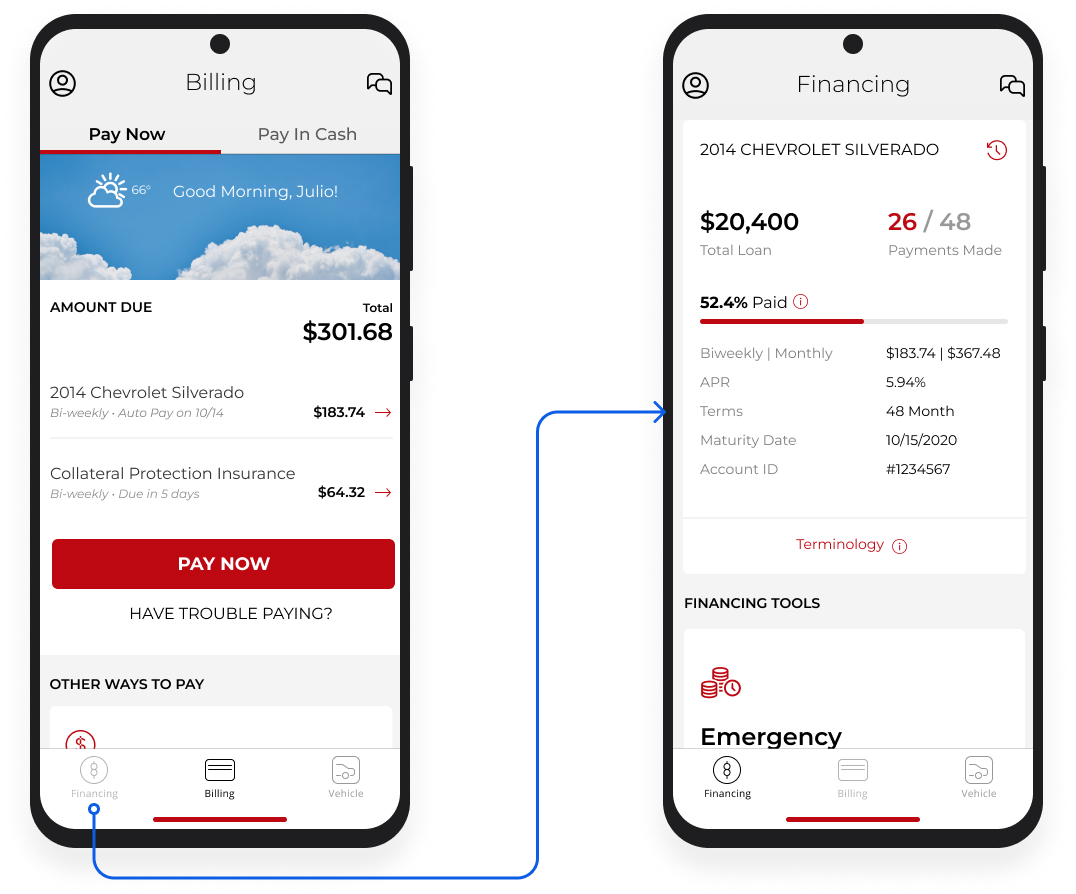
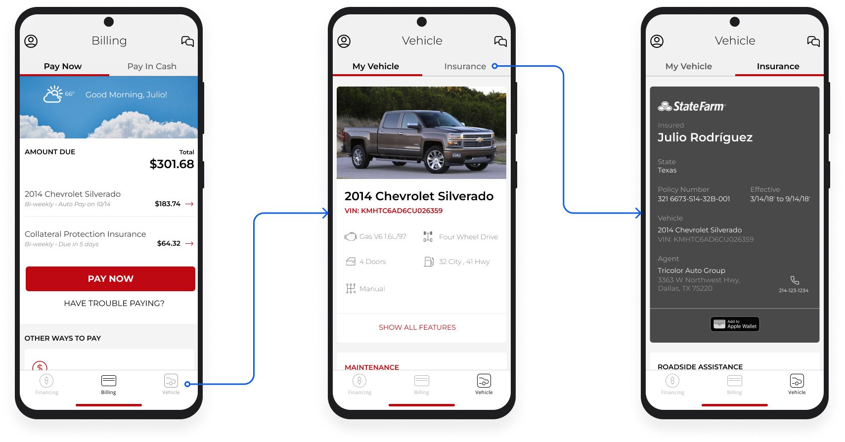
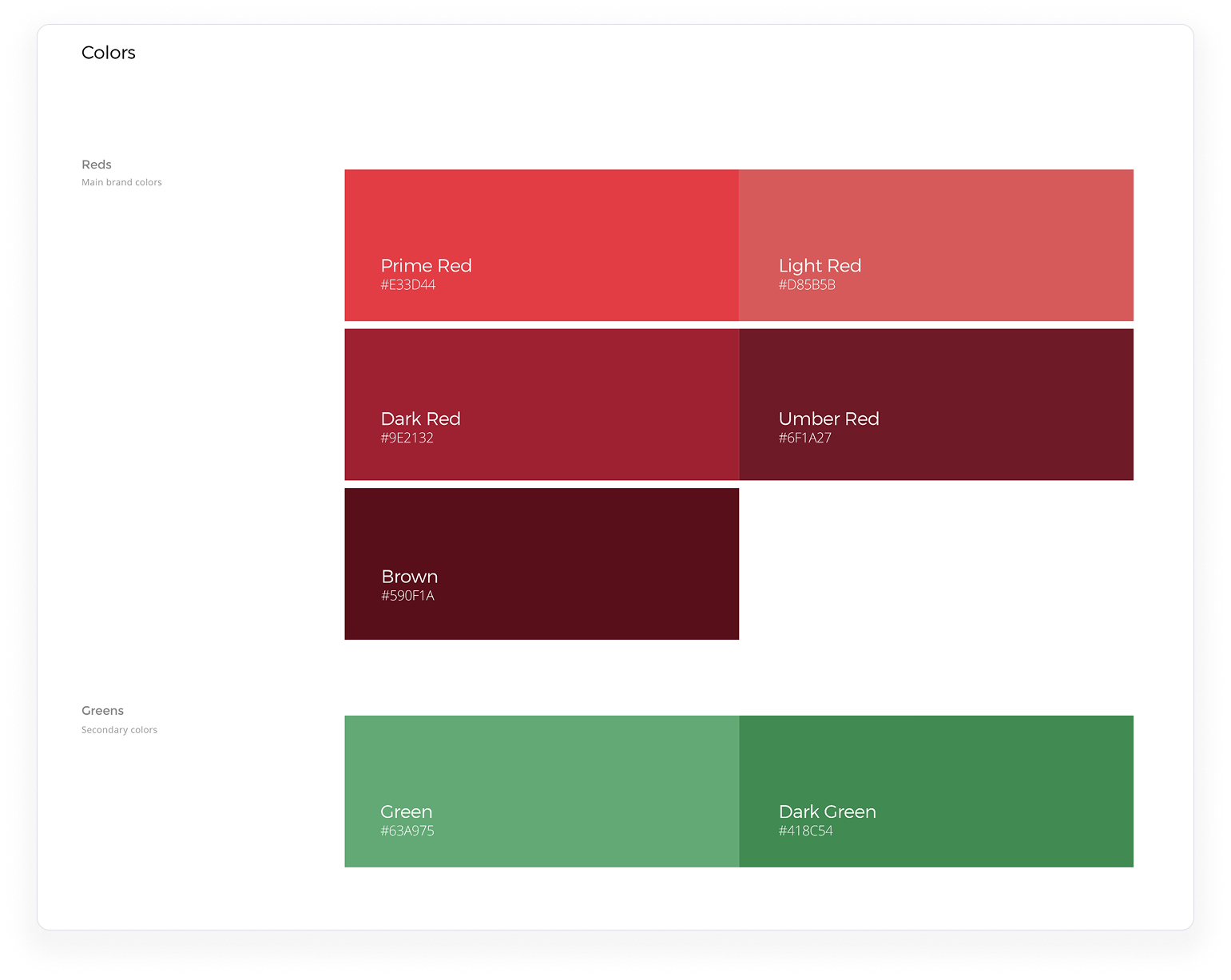
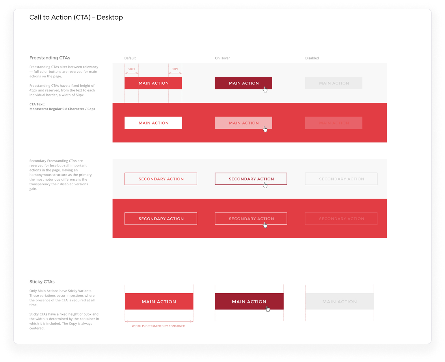
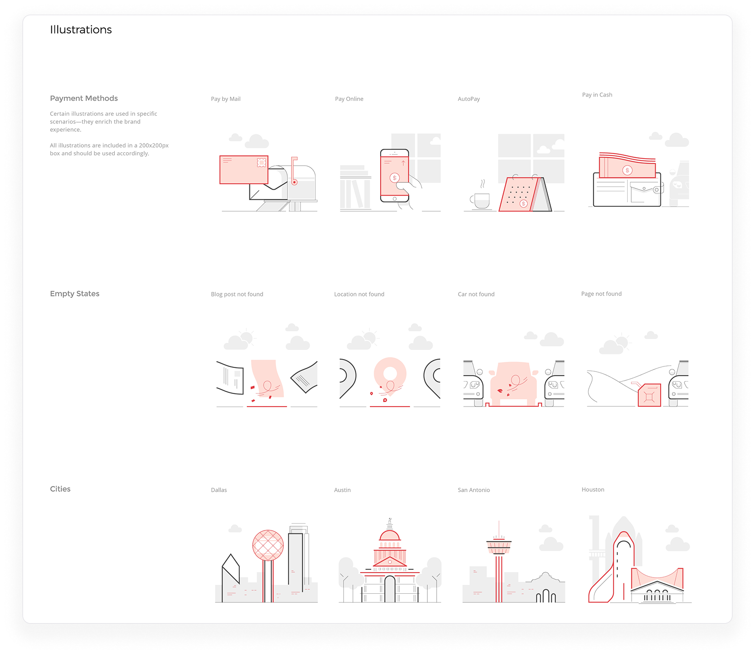
To bring consistency across touchpoints, I began the first iteration of a scalable design system to unify the look and feel of the web payment portal and mobile app under a single visual language. I defined core components, spacing rules, and brand-aligned UI patterns but, due to scope constraints, we documented the first version as a style guide. These factors made it easier for engineering to implement interfaces with fewer discrepancies while allowing future design updates to happen more efficiently and cohesively. 

Outcomes

  1. Design of a mobile app with a cohesive strategy and data-driven UX decisions.
  2. Robust documentation of innovative digital strategies.
  3. Internal stakeholders’ expectations were aligned and ready to plan a strong roadmap.