Story
Texakoma is a mining company specializing in oil and gas exploration, operation, and production. Its headquarters are in Plano, Texas. Some key company stakeholders contacted our team to discuss some problems they were experiencing with their internal “CMS” web app. Upon further review, it worked like a CRM, so registered reps could manage potential relationships with high-profile investors and other business agreements with key stakeholders.
Some managers shared stories about certain forms not being filled out according to their company policies, new employees struggling to complete their CRM training, and constantly working around technical problems with the system’s performance.
My role
I was the leading UX designer and was responsible for conducting a heuristics evaluation of the current web app, providing artifacts like user personas and workflows, and initiating the first phase of design discovery.
I collaborated with a multidisciplinary team, including product managers, full-stack engineers, and QA testers.
Challenges
1. Unconventional navigation pattern.
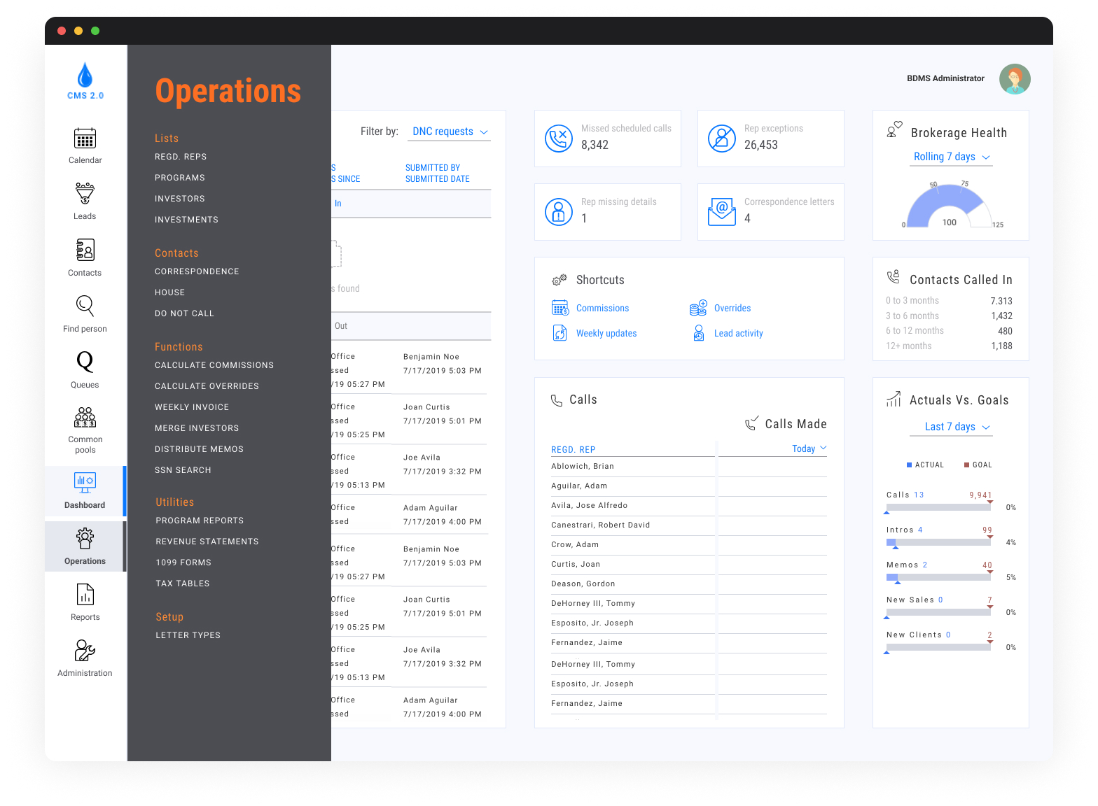
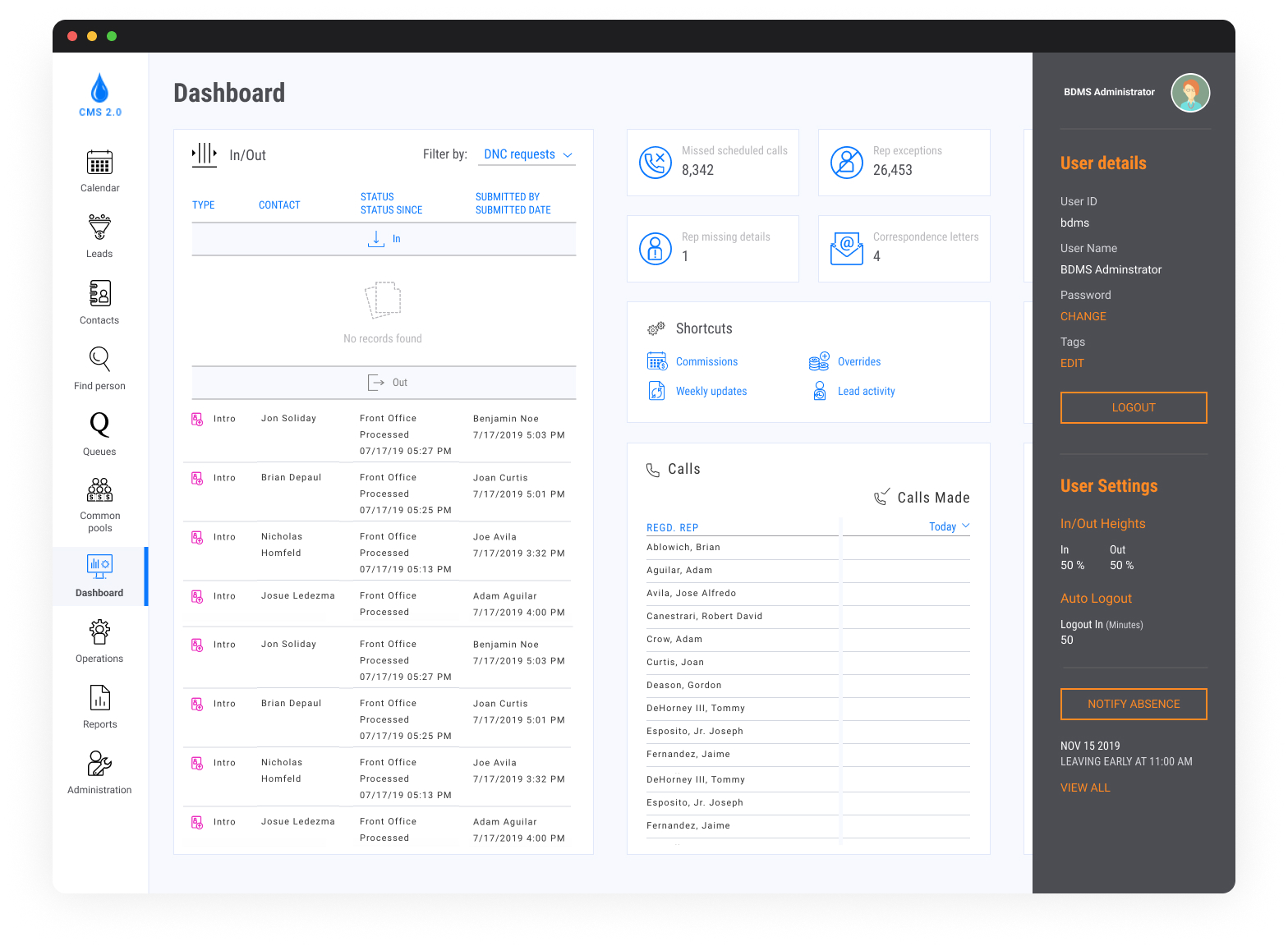
The main menu was located on the right side, which was a poor design choice considering that users were more familiar with Western-like conventions. That’s why we opted for the repositioning, adding visual elements to keep track of the current section and making clear what the home button or the section’s title is.
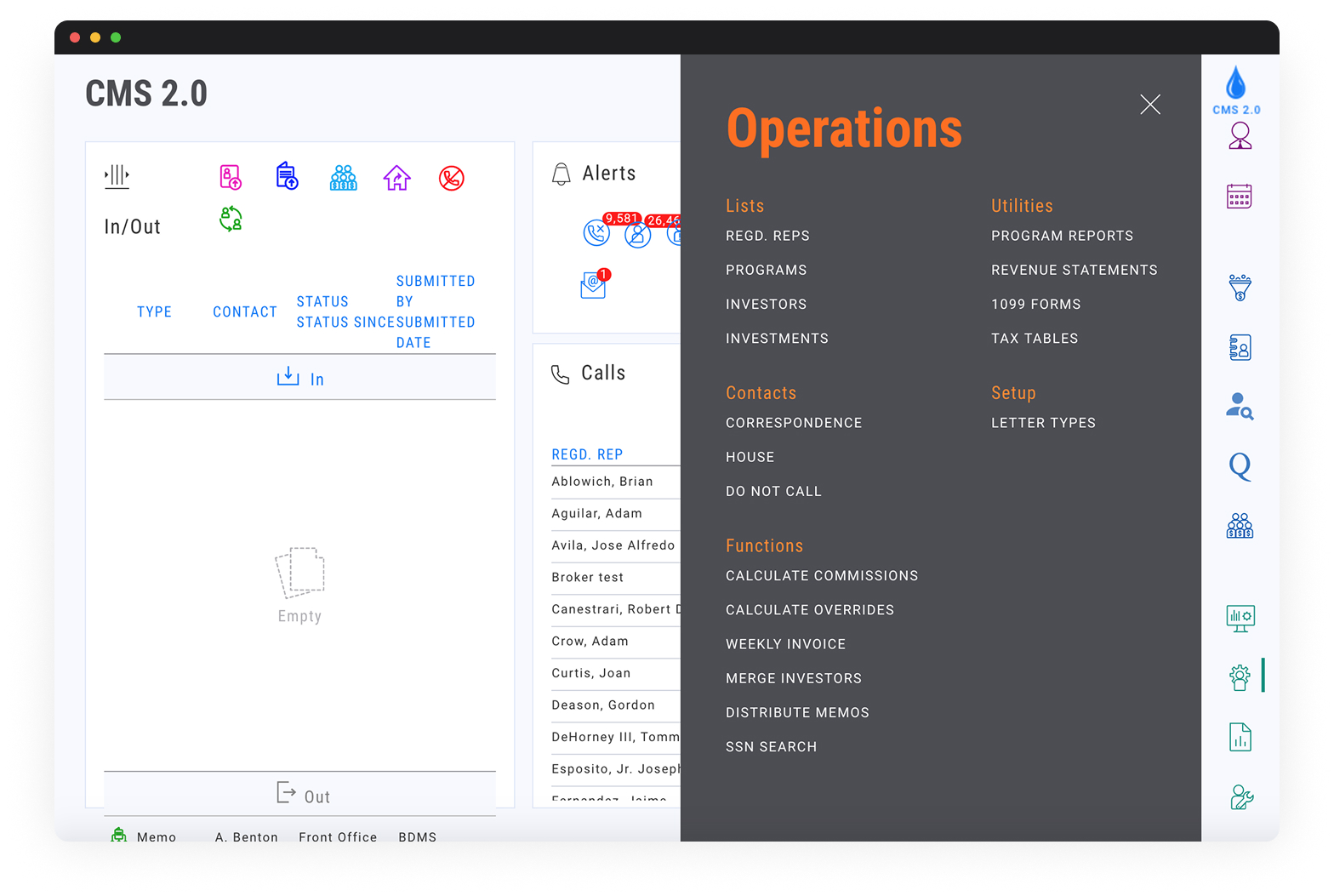
2. Excessive usage of icons for complex actions.
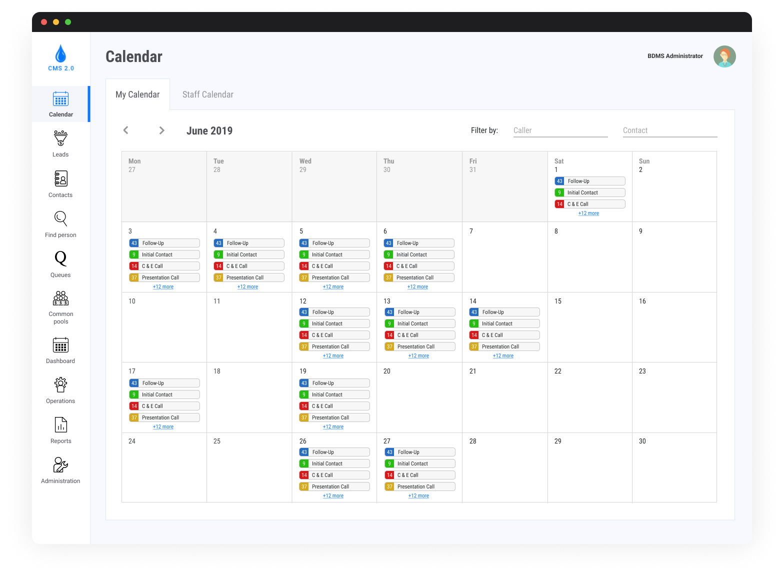
Some menu options used icons to represent the next page (e.g., leads or queues); while those may look minimalistic, they often create confusion and increase cognitive load, especially in complex applications. By adding text labels, we provide clarity and avoid ambiguity.
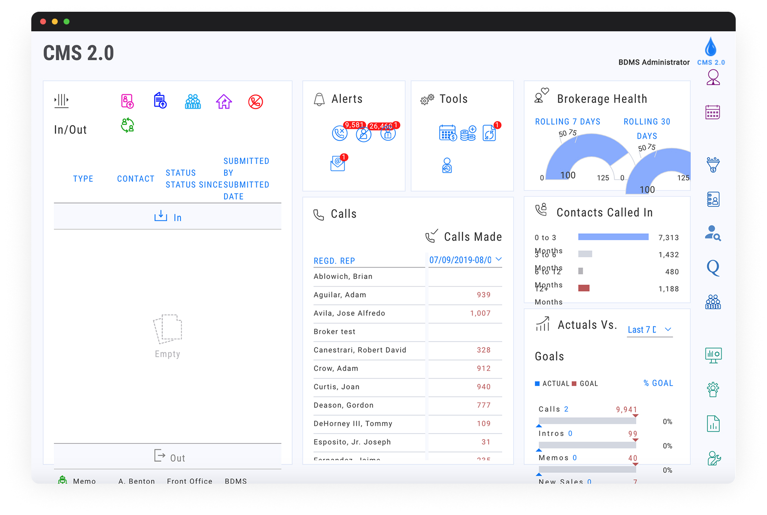
3. Non-responsive design.
You can see either graphics overlapping, labels with no space, strange alignment, unnecessary spacing at times, or overly big menus with no particular design reason. The hierarchy of elements was rearranged to present the most valuable information progressively.
Solutions
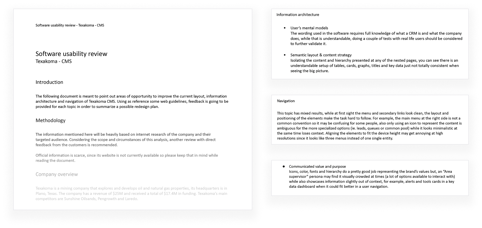
1. Analysis of usability problems.
I conducted a heuristic evaluation of the CRM, an exemplary method for identifying major and minor problems with an interface. Based on my findings, I categorized problems based on how frequently they happen, their impact on the experience, and their persistence. This allowed me to socialize how we could create a design strategy with company stakeholders.
2. Understanding user needs.
The company had little previous experience with UX or product designers, so this was a good opportunity to align expectations during some workshops where we discussed their “internal customers.” Beforehand, they usually disregarded how automated and efficient processes could impact the relationship between their employees and clients. Even if they struggled to strategize better, this was a key turning point in starting to work on actionable design solutions.
3. Improvements to content and information architecture.
I reorganized the navigation to reflect task priority, logically grouped related actions, and introduced clearer section headings. Additionally, I updated the terminology to be more intuitive and aligned with user expectations. These improvements aimed to reduce cognitive load, make the platform more self-explanatory, and open up discussions on content governance moving forward.
4. Design updates to improve the usability of the webapp.
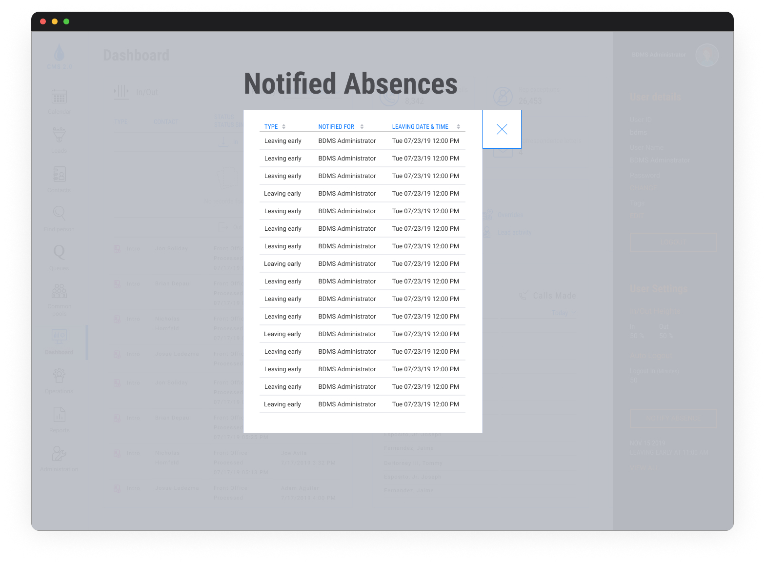
After analyzing the main pain points through stakeholder feedback and task flows, I identified key areas where minor design updates could significantly impact the experience. I introduced consistent button styles and spacing, optimized the dashboard layout, and improved the visibility of primary actions. Feedback mechanisms were added to let users know when their actions were successful or required attention. These updates focused on clarity, predictability, and ease of use.
Outcomes
- A new version of the web app combines consistent experiences and performance enhancements.
- Reduced users’ frustration when navigating the system and working to accomplish their daily tasks.
- Reduced errors when reps submitted information on the CRM, which allowed managers to provide better insights from potential clients.
- Compliance with modern desktop browsers.

