Internal Operations Software
Story
Tekzenit is a full-service IT solutions provider specializing in user experience engineering, custom software development, and strategic consulting. Some key stakeholders from the HR department reached out to our team to share concerns about the way we engaged with candidates and employees. That included a quite old web app that the company used for around 8 years without any meaningful improvement to the experience, features, and architecture.
That web app wasn’t compatible with HR processes, and it was almost impossible to get productivity insights or receive timely notifications about special circumstances. The high learning curve to use that platform and its non-intuitive interface represented a barrier to its users.
My role
I was the leading UX designer responsible for conducting a heuristics evaluation of the current webapp, providing artifacts like user personas, user stories, journey maps, and the first phase of design discovery.
I collaborated with a multidisciplinary team, including full-stack engineers and QA testers.
Challenges
1. Poor definition of product roadmap.
The absence of a clearly defined roadmap made it difficult to work on a prioritization matrix before any design discovery. It was challenging to align design ideas with business objectives and user needs. Decision-making was reactive and inconsistent. This lack of direction created confusion around project scope and deliverables, which made stakeholders unsure of what to expect or when.
2. Product management responsibilities were shared.
Responsibilities for product direction were scattered across several roles, leading to overlapping decisions and inconsistent communication. Without a dedicated product owner, it was uncertain who was accountable for final decisions. It was common for me and the developers to work without clear input or validation from leadership, and valuable time was spent in clarification meetings rather than progressing on deliverables.
3. Inefficient processes with error-prone tasks.
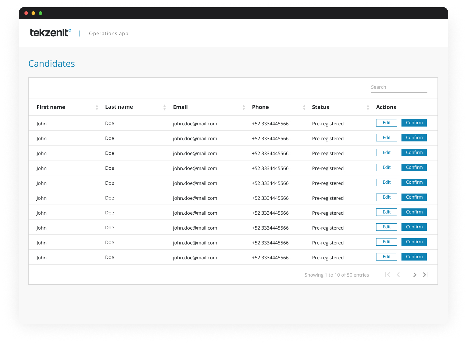
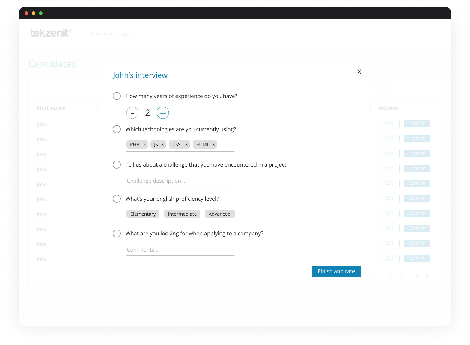
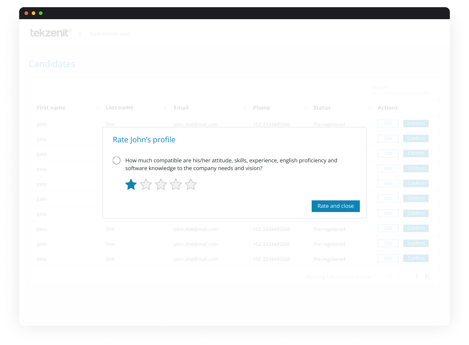
HR staff were used to doing manual tasks that were easy to get wrong. For example, submitting candidate information required sending those resumes by email to key stakeholders based on the position; however, technical interviews and resume reviews got delayed frequently due to a lack of visibility into those processes. There was no “source of truth” for the status of ongoing processes; they had to compare LinkedIn conversations, emails, and whatever details someone captured in the webapp. As a result, collaboration across teams became unreliable, and people were encouraged to work around instead of leveraging a streamlined workflow.
Solutions
1. Understanding user needs.
Since the company’s HR department had limited UX exposure, I started with workshops to understand expectations and pain points. These conversations revealed how disconnected the web app was from real HR workflows. By identifying key frustrations and missed opportunities, I created a foundation for UX strategy with consistent user personas, which ensured actual needs would drive the design.
2. Took ownership of the new product planning phase.
Recognizing the gap in leadership, I stepped in to help structure the early product planning efforts. I facilitated sessions to prioritize user stories, which helped us create a draft roadmap with rough goals and timelines. By documenting those decisions, we got solid alignment with engineering while ensuring that UX had a voice at the table from the beginning. The roadmap became a living document we could all reference.

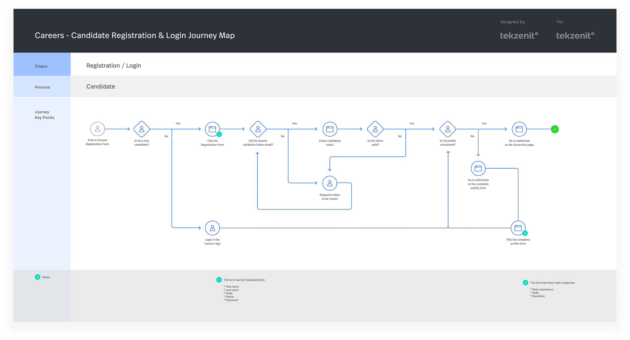
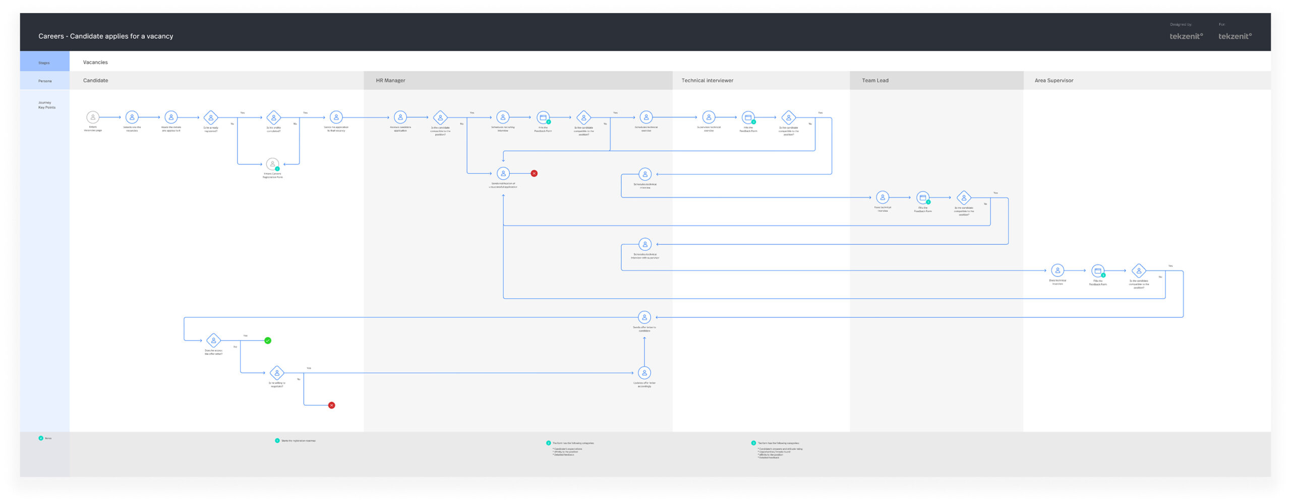
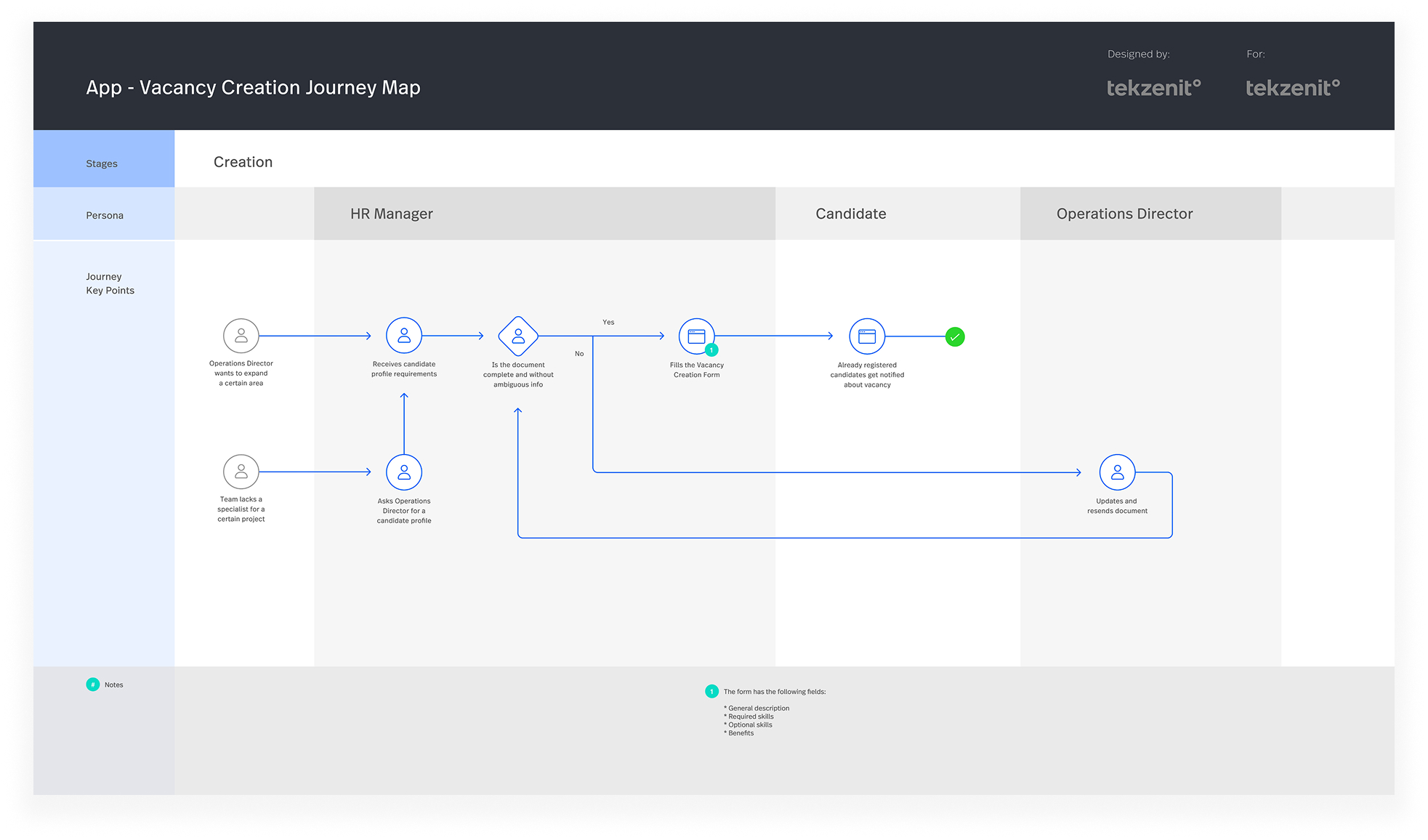
3. Build journey maps that match the company vision.
To bridge the gap between user frustrations and business goals, I developed journey maps that reflected real HR scenarios. These maps helped uncover moments of friction and opportunities for automation. Sharing these maps with the team stakeholders allowed us to focus on solving the right problem and connect that with ideal strategic goals.
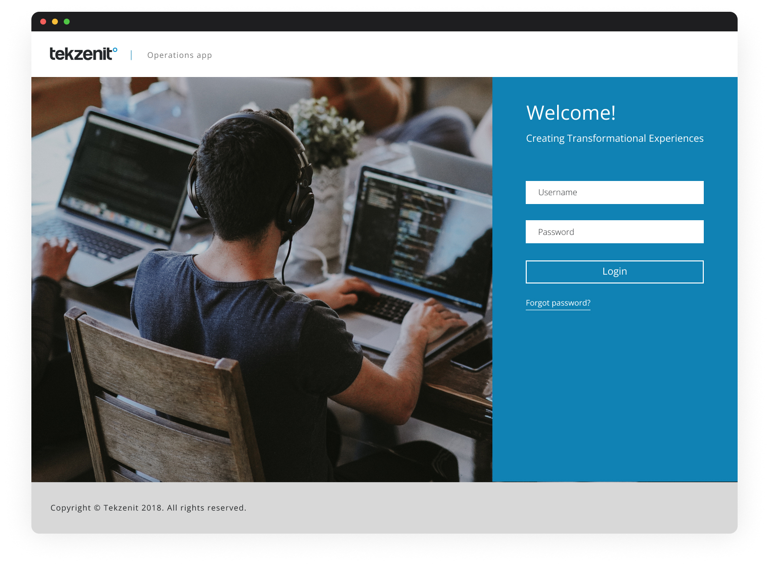
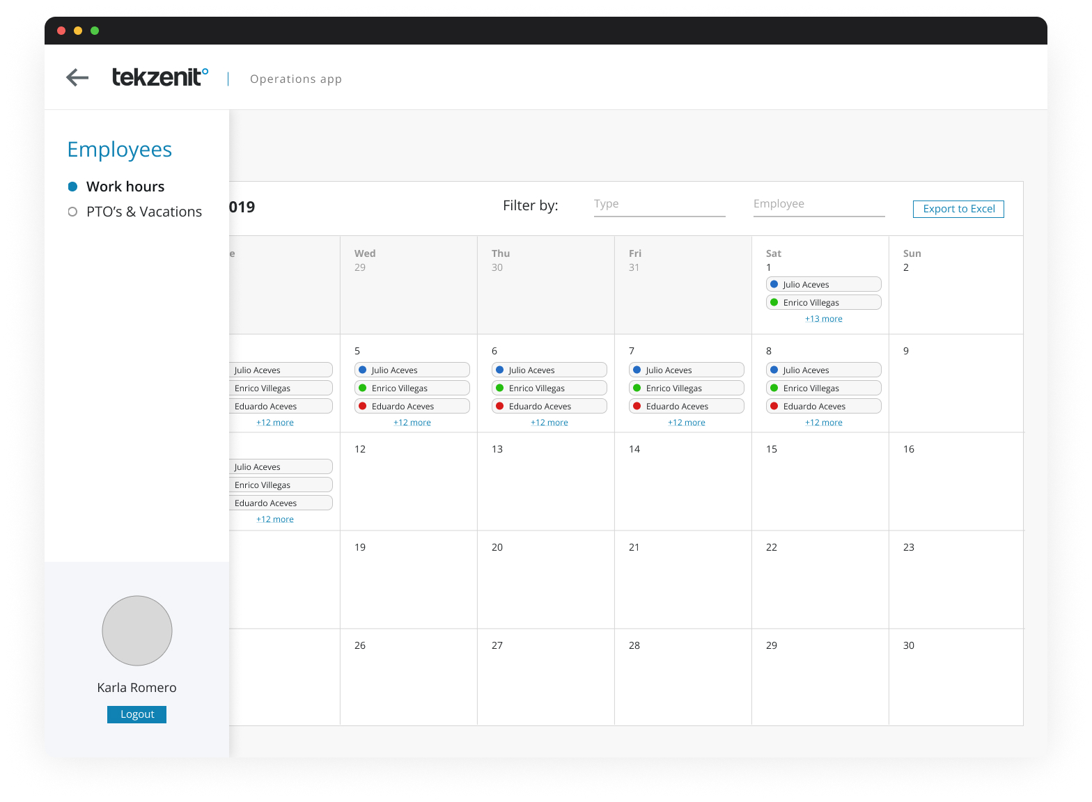
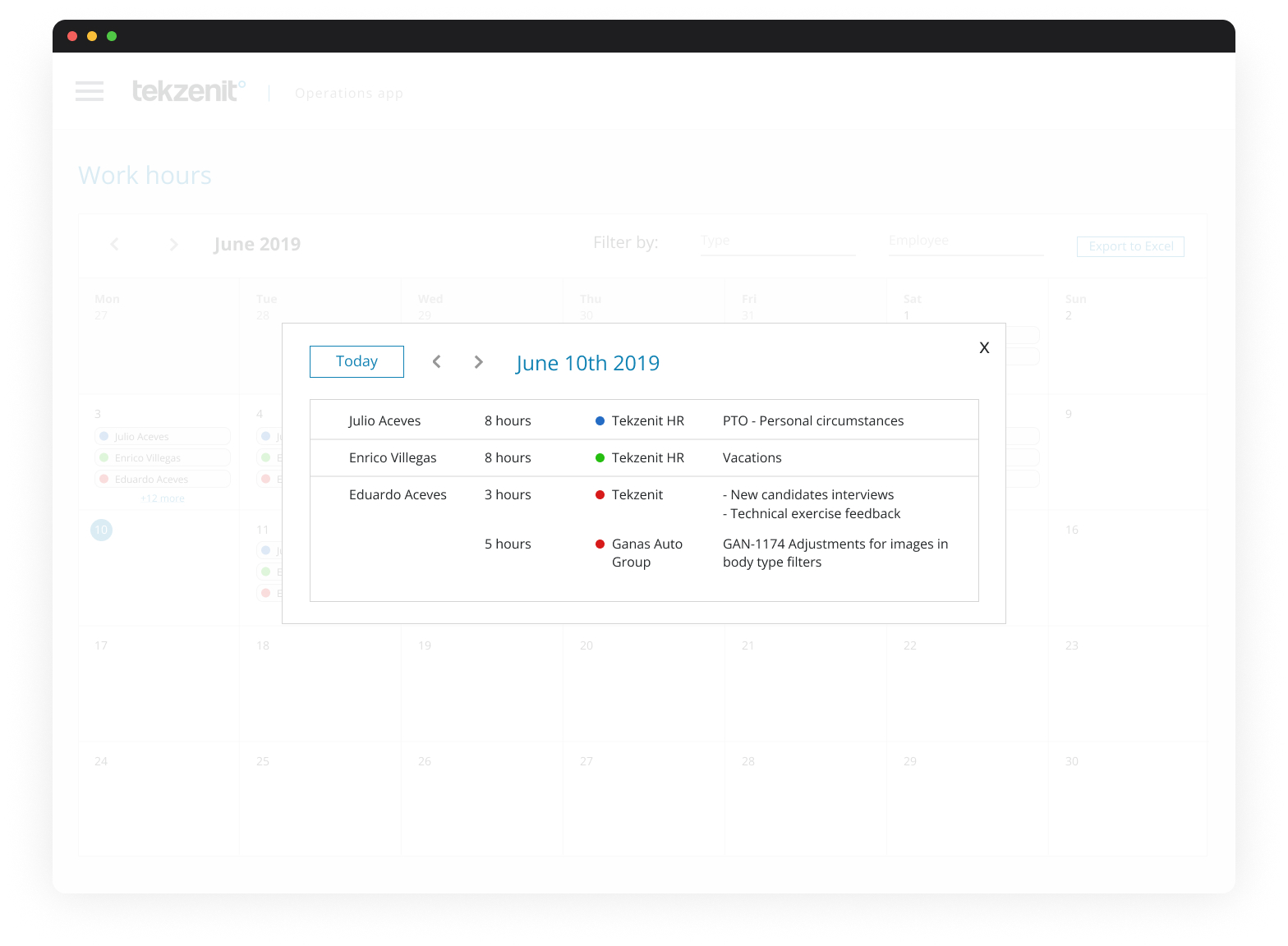
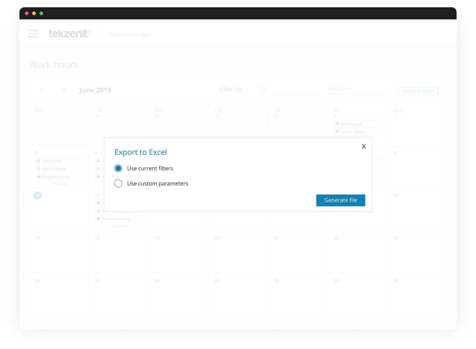
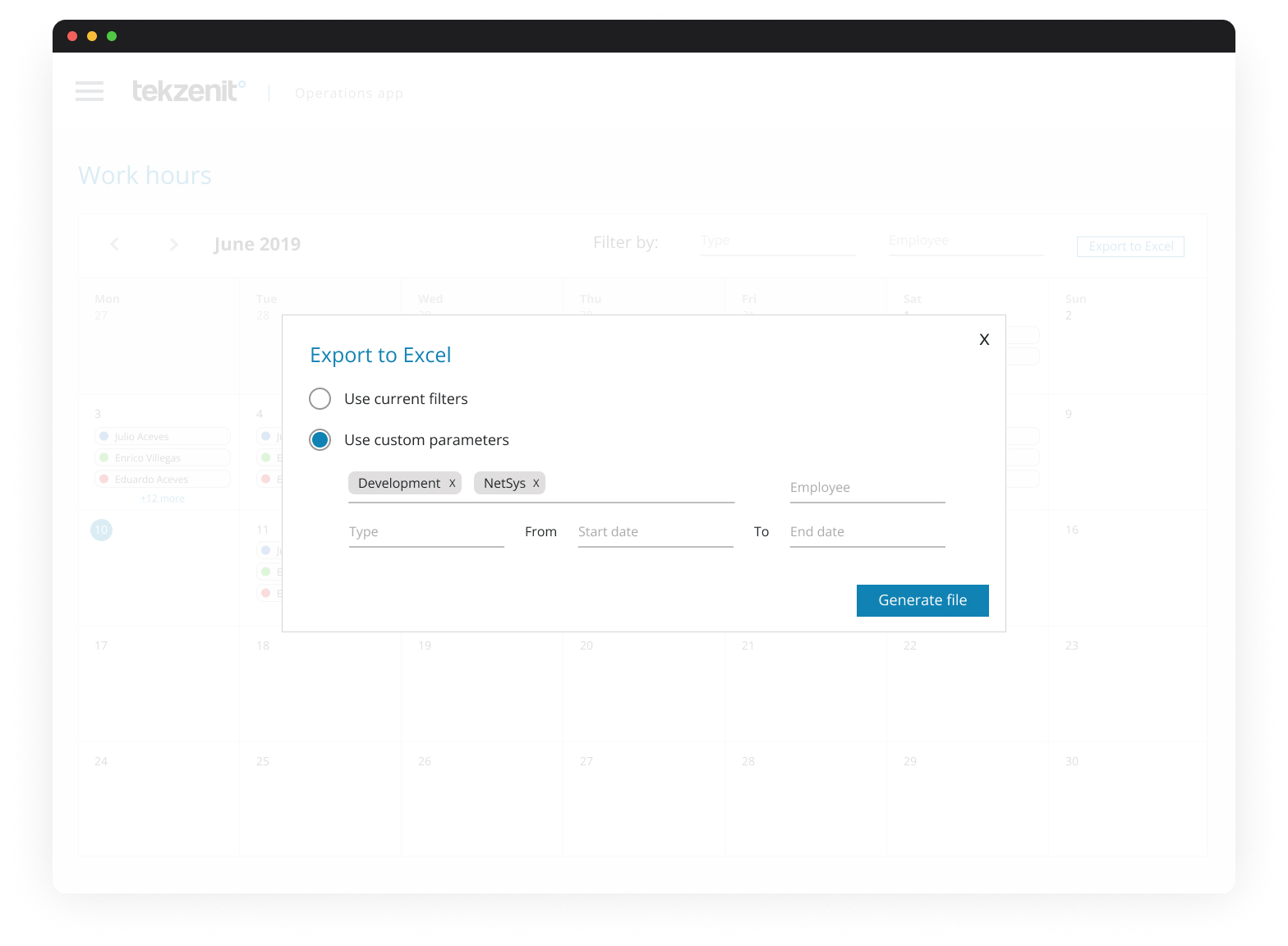
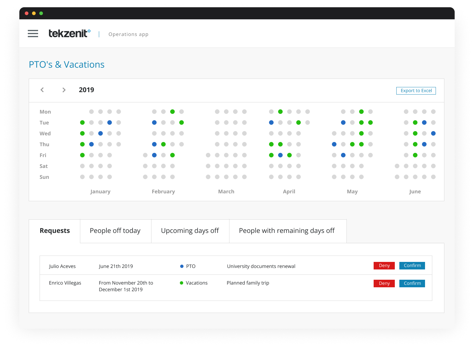
4. Design discovery of new look & feel.
With research in place, I moved into early design discovery focused on interface clarity and consistency. I explored modern patterns to replace outdated elements and reduce the learning curve. This phase required multiple feedback loops and iterations with stakeholders to meet expectations. The new look brought a sense of cohesion to the platform and highlighted essential tasks. Small things like spacing, labels, and iconography significantly improved usability compared to the legacy version.
Outcomes
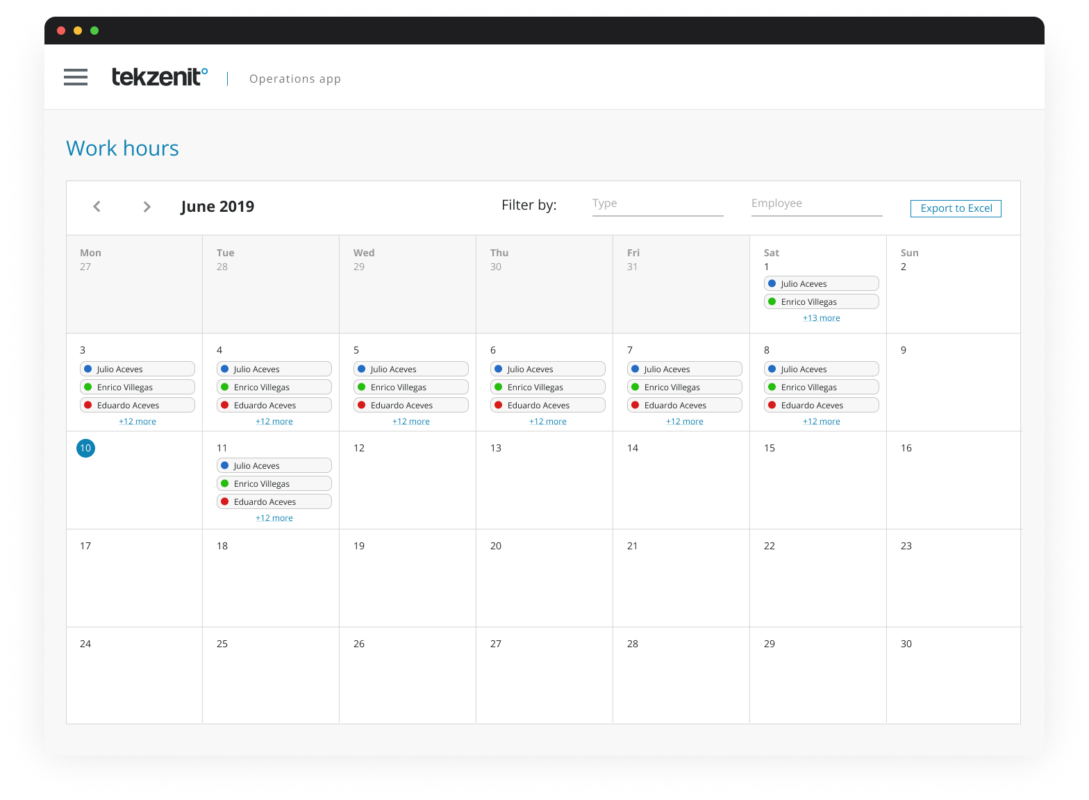
- Complete redesign of webapp combining consistent experiences and performance enhancements.
- Robust documentation of updated HR processes for candidates and employees.
- Reduced errors when recruiters submitted new and existing roles.
- Internal stakeholders’ expectations were aligned and ready to plan a strong roadmap.