Ikon Connect
Story
Ikon Technologies’ founding members had experience in the car dealership business. Since they knew most of the daily challenges, they looked for ways to innovate in that industry. Ikon Connect was released as one of the multiple products to complement solutions for lot management and other GPS solutions. It was a game changer for some time. Still, competitors started to offer similar alternatives with better quality of life features, and Ikon Connect needed something to further stand out in the industry.
Upon reviewing some of the early heuristic reviews conducted with key company stakeholders, there was a clear lack of identity and alignment with the brand’s core values. Some of the app features disregarded target customers’ needs and focused instead on feasibility, business goals, and repeating patterns from other Ikon Technologies products.
My role
I was the leading UX designer and responsible for making a competitor analysis of GPS-focused apps, doing research (generative and evaluative), and socializing findings to key stakeholders, providing artifacts like user personas and journey maps, documented all of Ikon’s best practices and brand guidelines to build a first iteration of a design system and worked on the design discovery to achieve the first public-available build of Ikon Connect.
I collaborated with a multidisciplinary team, including product managers, web and mobile engineers, QA Testers, hardware specialists, call center reps, and marketing strategists.
Challenges
1. Lack of innovation and a heavy focus on feasibility.
Many design decisions for the legacy app were driven purely by what was most straightforward to implement, rather than what users needed. The app lacked standout features, preventing the product from differentiating itself in the asset location and car dealership business. Key stakeholders in the company often dismissed any ideas from the team early due to resource concerns rather than being evaluated for long-term impact. However, this only exacerbated the need to reintroduce creativity into the product lifecycle.

2. Non-existent product roadmap.
There was no clear vision guiding the evolution of Ikon Connect, which made planning for all teams difficult. Most of the feature prioritization happened reactively, often based on anecdotal input from stakeholders or quick-fix requests from support agents. Without a shared direction, the team struggled to track progress or measure success and focused instead on iterating on features that didn’t necessarily align with user needs or business goals.
3. Poor communication among internal stakeholders.
Communication between departments was fragmented, and product managers, engineers, and customer-facing teams often had different understandings of the app’s goals. Valuable insights from call center reps and sales staff rarely made it into product planning, and even design decisions were sometimes interpreted inconsistently due to the absence of shared documentation. All this created friction during handoffs and delayed iterations every time we tried to make releases after the end of a sprint.
4. The company’s UX maturity was very low.
UX wasn’t part of the company culture, and its value was vague or secondary to most stakeholders. The company had not previously employed a dedicated UX designer, and many teams worked without formal user insights. Other employees saw the design practice as a way to “beautify” interfaces instead of a key part of the product development cycle and, most of the time, resulted in inconsistencies, guesswork, and features that failed to meet user needs. Elevating UX maturity required a mindset shift and introducing scalable processes, while building trust and educating others on how UX contributes to business outcomes.

Solutions
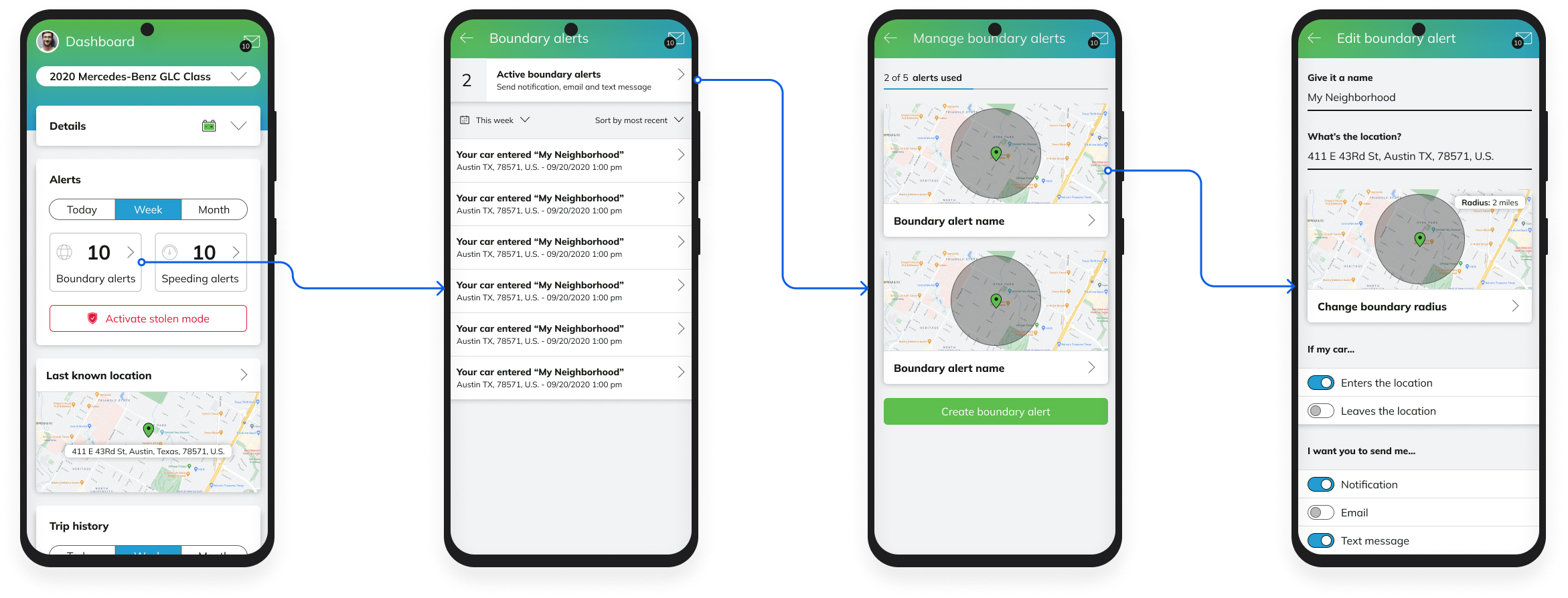
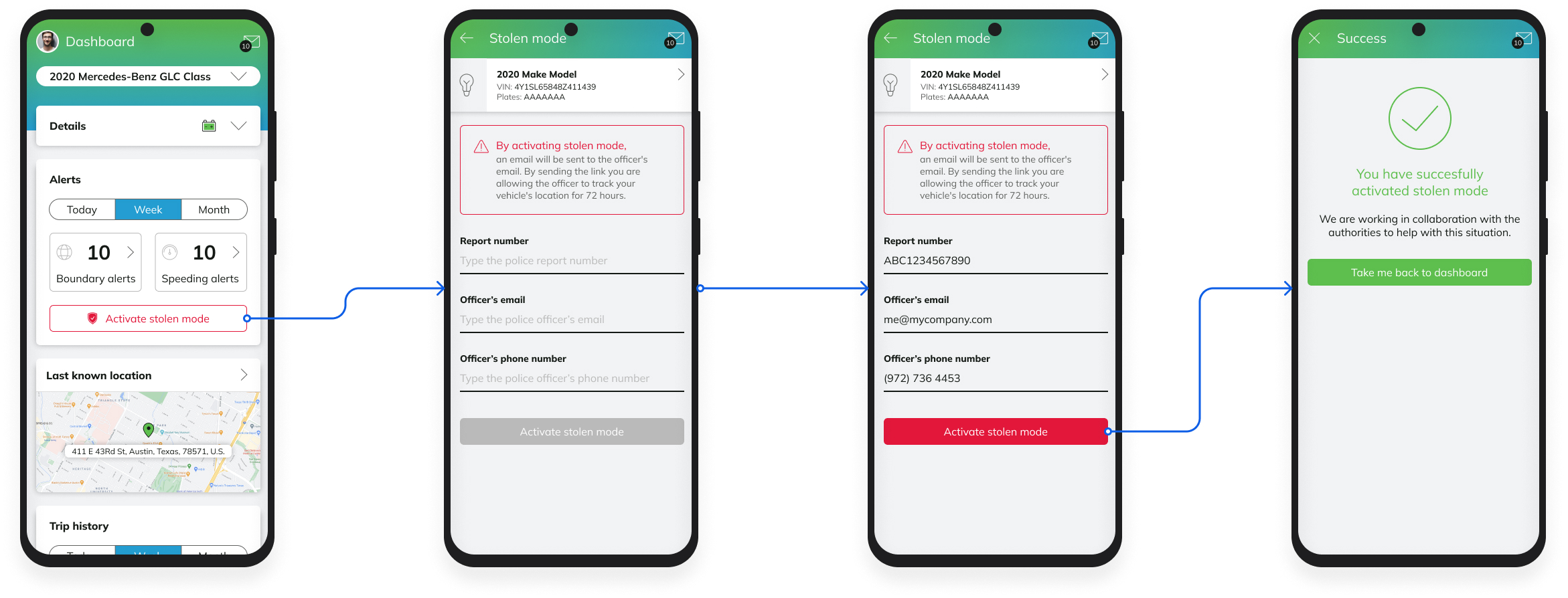
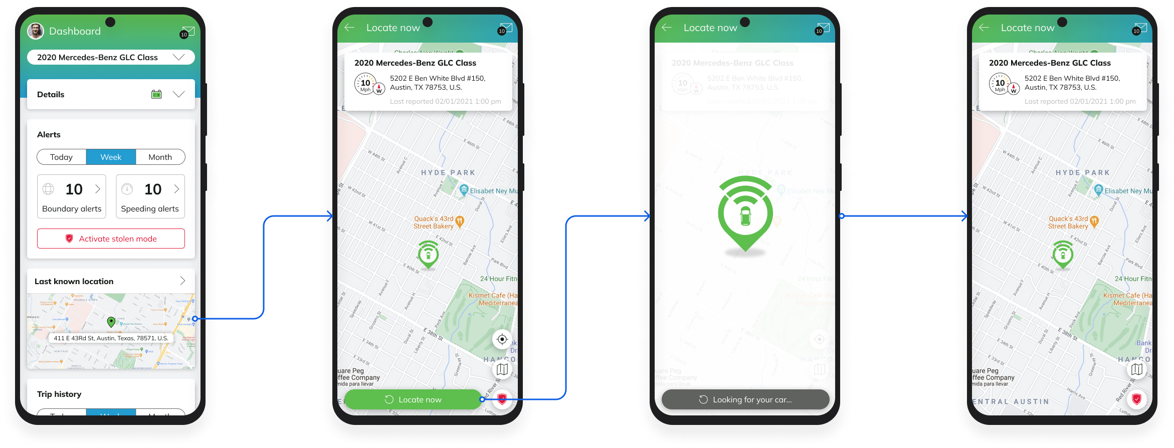
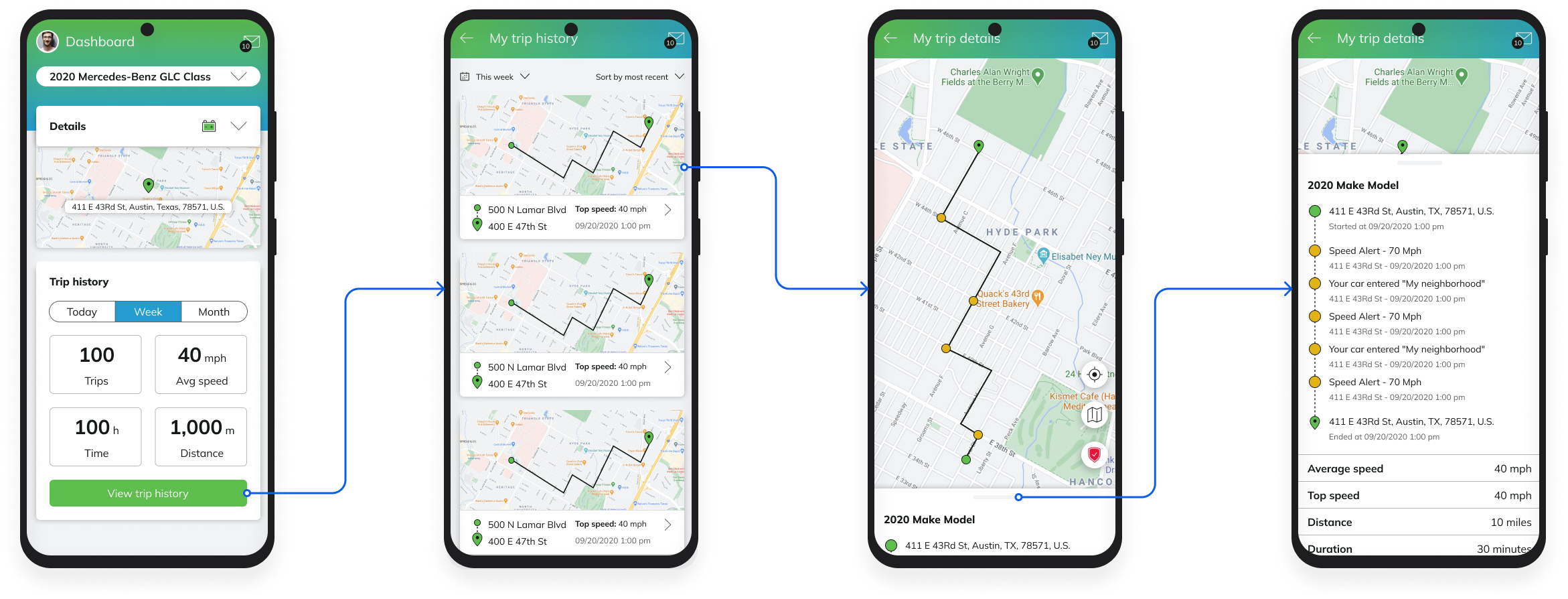
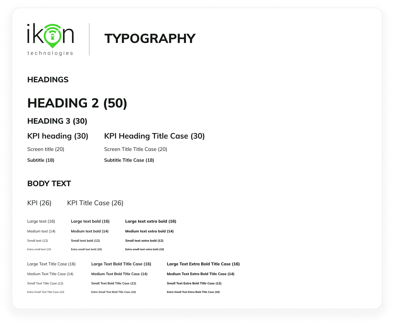
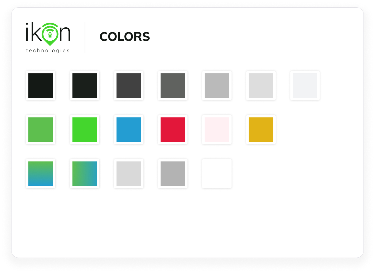
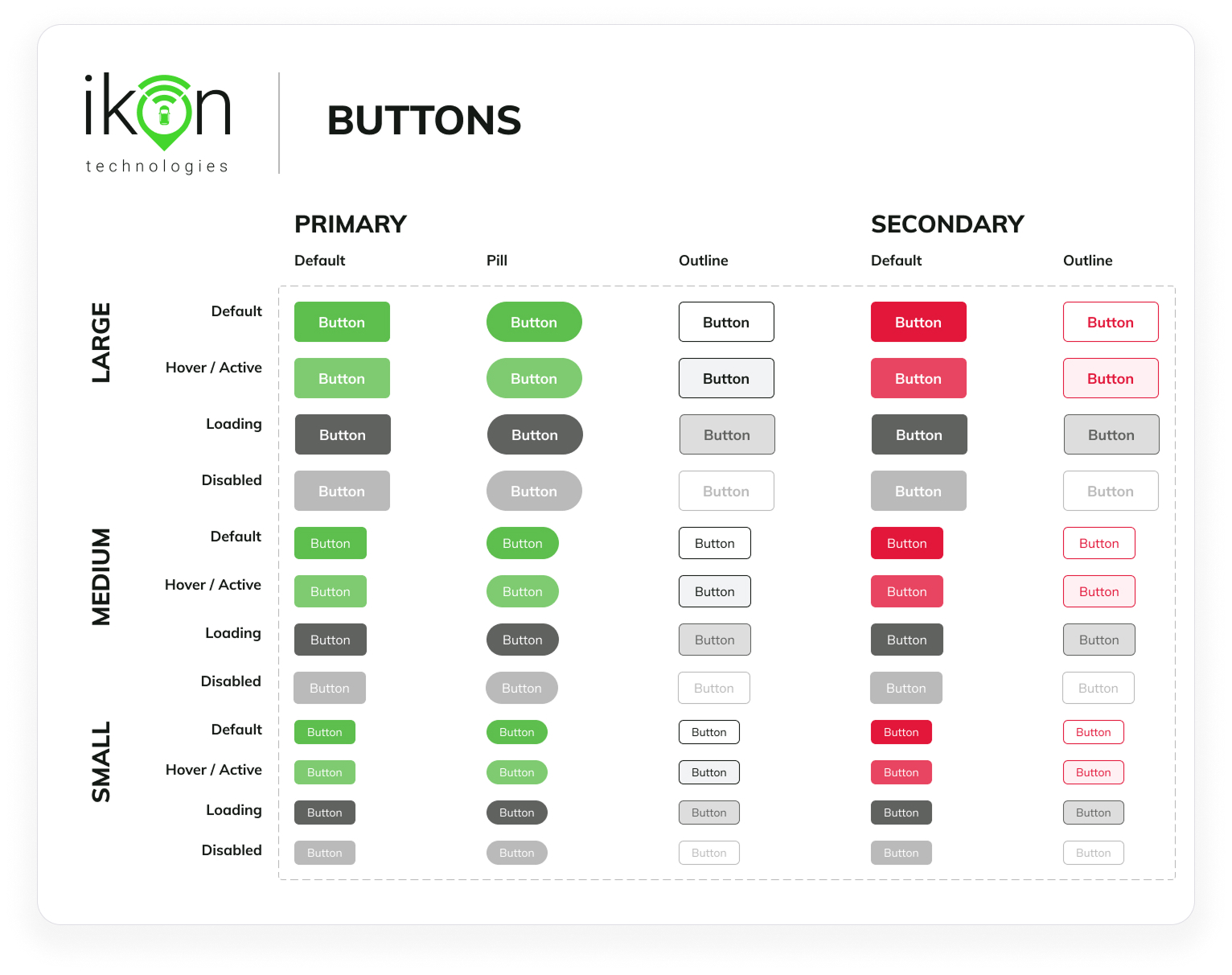
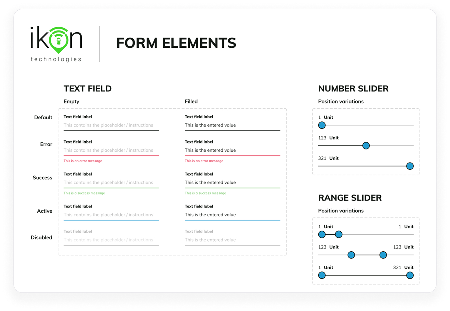
1. Created a brand-new design system.
To ensure consistency and improve scalability, I developed the first iteration of a design system tailored to Ikon Connect web and mobile applications. It included reusable components, typography guidelines, iconography, and interaction patterns aligned with the brand. The system helped unify the user experience across different modules and platforms, reducing handoff friction with engineers and speeding up development feedback. Visual consistency contributed to increased user trust and brand recognition. The design system became a central reference point for future enhancements and, over time, it fostered a more organized and collaborative design process.
2. Helped elevate the company's UX maturity.
I introduced structured UX practices such as user interviews, journey mapping, and usability testing to build awareness around user-centered design. I demonstrated how user insights translated into better product decisions by actively including stakeholders in the research process. Eventually, having that support from those people allowed me to document best practices and share them in accessible ways across departments. It took several months, but the company culture shifted slowly and improved the overall quality of discussions and decision-making.
3. Involved key stakeholders in the product lifecycle.
I facilitated workshops, walkthroughs, and review sessions that included voices from engineering, product, sales, and support. This collaborative approach helped bridge gaps between teams. It ensured that diverse perspectives shaped design decisions, which is when stakeholders better understood users’ pain points and how the app could potentially address them. By co-owning parts of the UX process, teams became more invested in the outcomes and created a culture of shared responsibility around product quality.

4. Documented and socialized research.
I led generative and evaluative research efforts to uncover the needs of both B2C and B2B users. I synthesized all findings into clear artifacts like personas, journey maps, and insight summaries. Once ready, I also shared these materials across teams to promote transparency and alignment. This allowed research to inform product decisions on feature prioritization and potential deliverable value. This made users’ needs more visible across the organization and fostered a more empathetic product development environment.
5. Emphasis on agile UX deliverables.
To support the agile nature of development, I created lean, iterative UX deliverables that were easy to act on. These included wireflows, interactive prototypes, and prioritized feedback summaries mapped directly to sprint goals. I collaborated closely with engineers during implementation to ensure fidelity and clarify edge cases. Agile UX practices made adapting easier without sacrificing quality or consistency, mainly because this method helped keep momentum without sacrificing user-friendly ideas.
Outcomes
- The product roadmap was achieved with little tech debt.
- Ikon Connect was heavily customizable, which opened a new business opportunity with car dealerships.
- Most teammates had a solid understanding of UX and how it impacted their work.